


01 / Context
Project Context
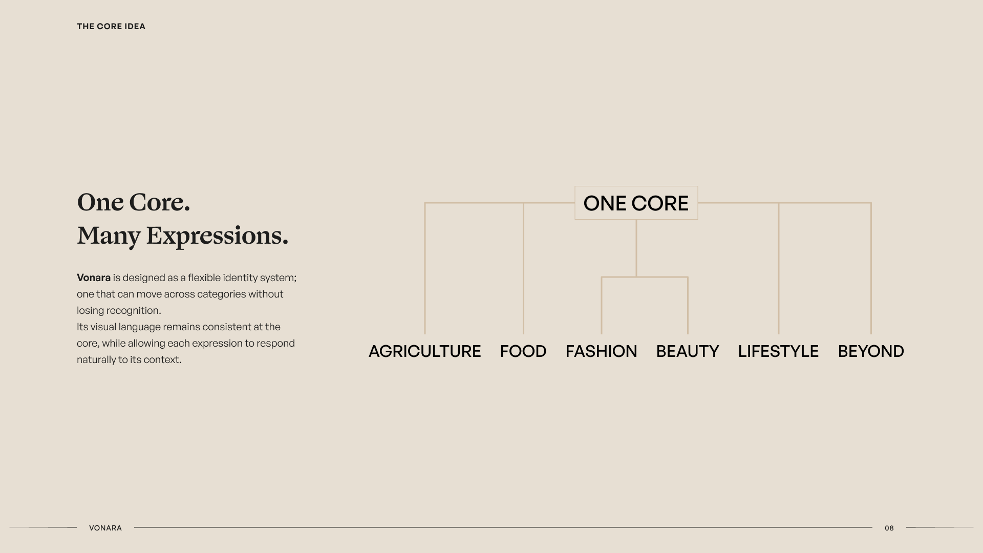
Vonara was conceived as a consumer brand with ambitions beyond a single product or category, spanning agriculture, fashion, lifestyle and beauty.
Its first product brought that ambition into something tangible: packaged Acha, also known as Fonio, a grain with deep roots in West African food culture.
We worked with Vonara from the brand outward, developing an identity that could grow with the business and then applying it to packaging and a digital experience for its first product launch.

The challenge
Vonara's first product needed to feel contemporary and desirable without losing the familiarity of what it was selling.
At the same time, building the entire identity around agriculture would limit a brand intended to eventually operate across very different consumer categories.
The challenge was therefore larger than designing a package for Acha. We needed to establish a recognisable parent brand, give its first product enough character to stand on its own, and create a system capable of accommodating whatever Vonara introduced next.
02 / Brand
Building the Brand
We started with Vonara itself rather than the product.
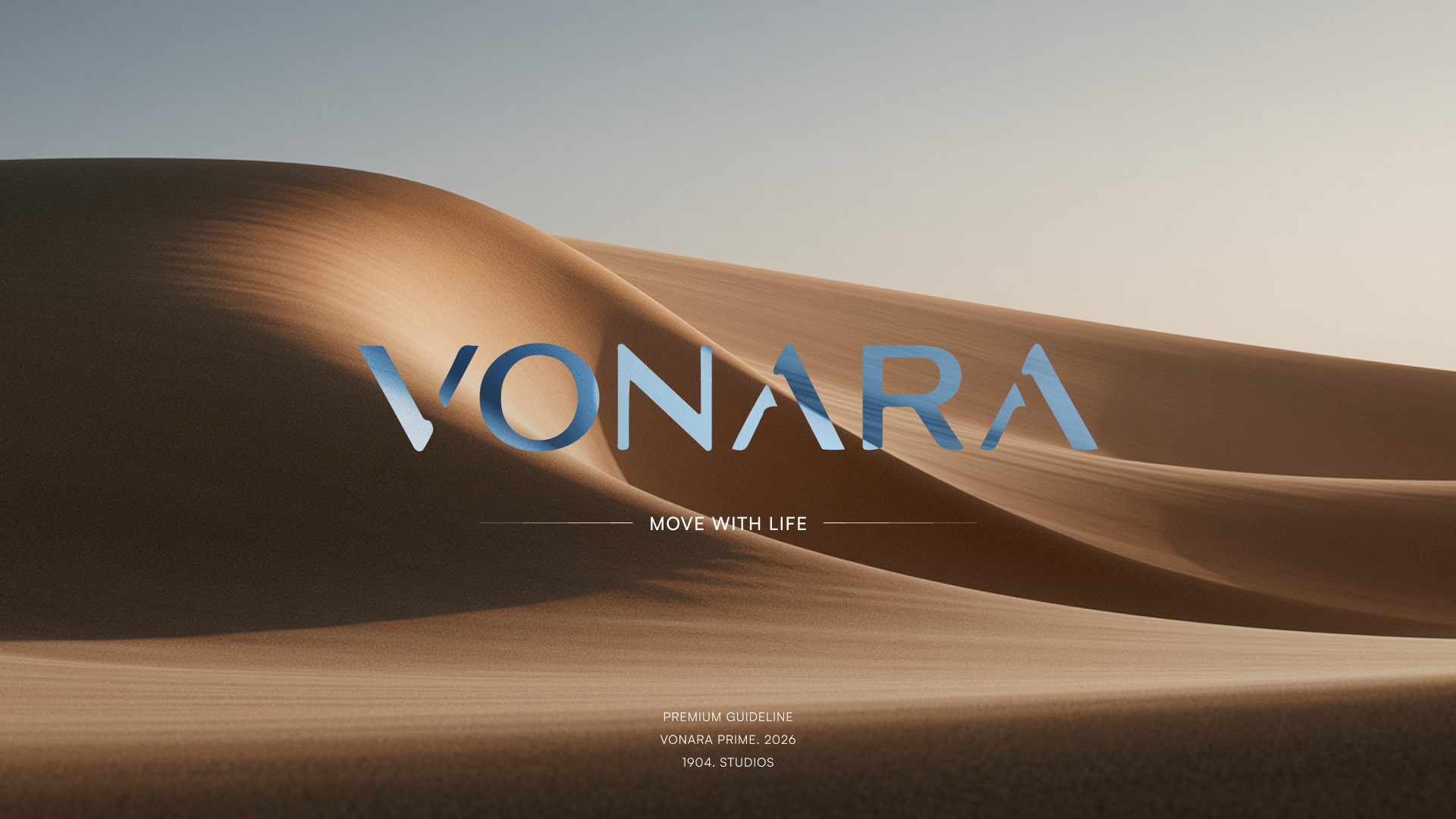
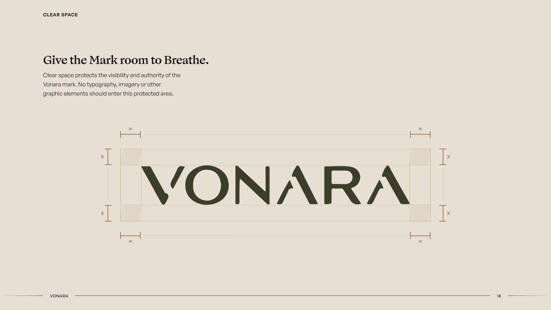
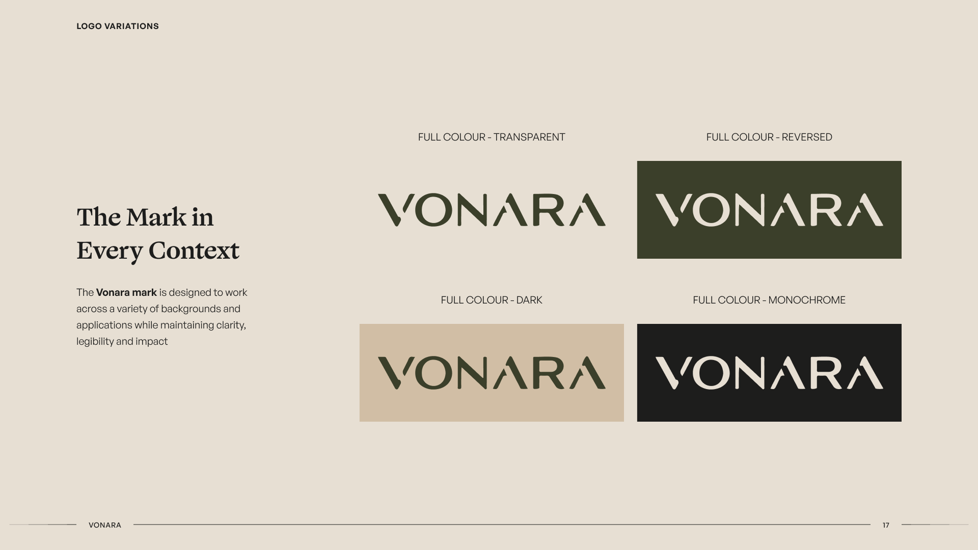
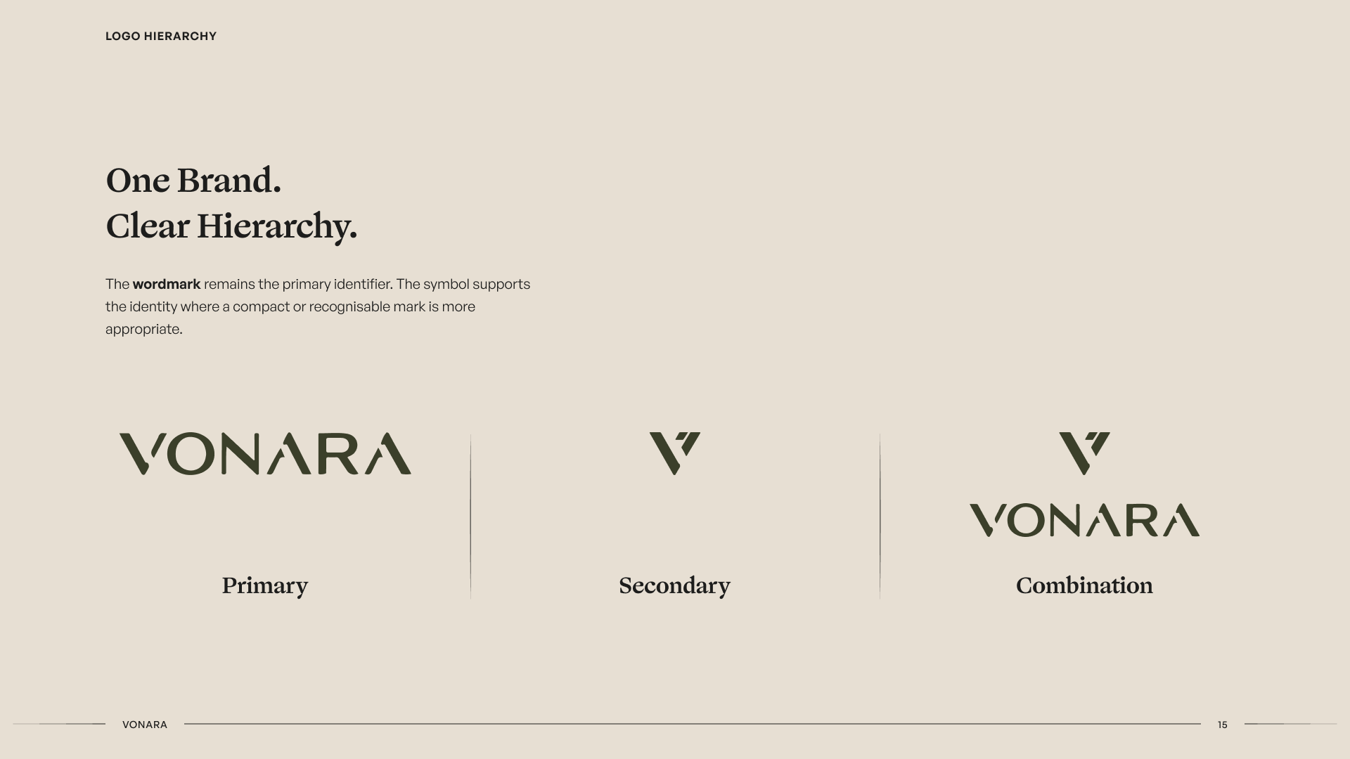
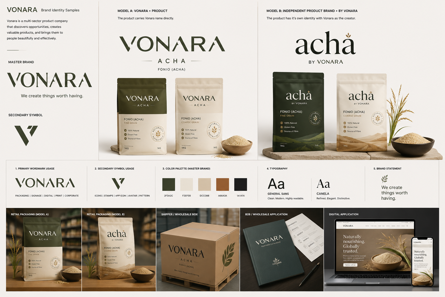
The wordmark became the primary identifier, supported by a compact symbol that could work as a stamp across packaging, digital applications and smaller brand moments.
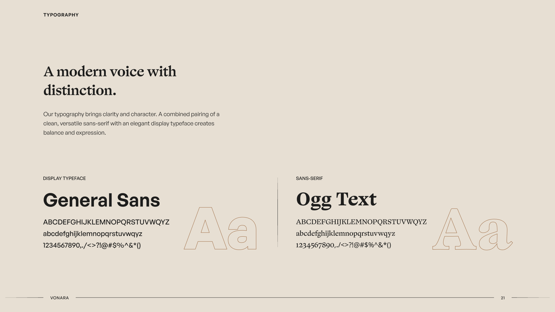
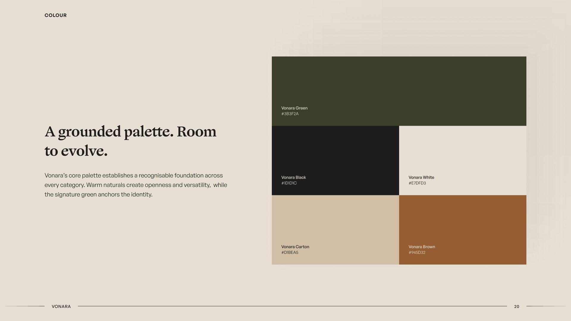
The wider visual language was kept warm, confident and restrained. Typography, colour and imagery were chosen to give Vonara a premium consumer presence without tying the identity to a particular category.


Design for recognition before expansion
Vonara needed enough consistency to become recognisable before it needed complexity.
Rather than creating separate visual languages for every possible business area, we established a strong parent identity and allowed individual products to introduce their own character underneath it.
Keep the system warm, not ornamental
A premium food product can easily drift into decorative visual language.
We kept the system relatively simple and used proportion, typography, material, photography and space to create character instead of adding visual elements without a clear role.
03 / Product
Designing the First Product
Acha became the first real test of the Vonara system.
The grain has a long history in West African diets, but the product needed to communicate comfortably to customers encountering it in a modern retail or digital context.
We focused the experience around what someone needs to understand quickly: what it is, why it is useful and how it can fit into everyday meals.

Rather than positioning Acha as something unfamiliar that needed reinvention, the work presents an existing food in a form that feels considered, accessible and ready for a wider audience.
04 / Packaging
Packaging
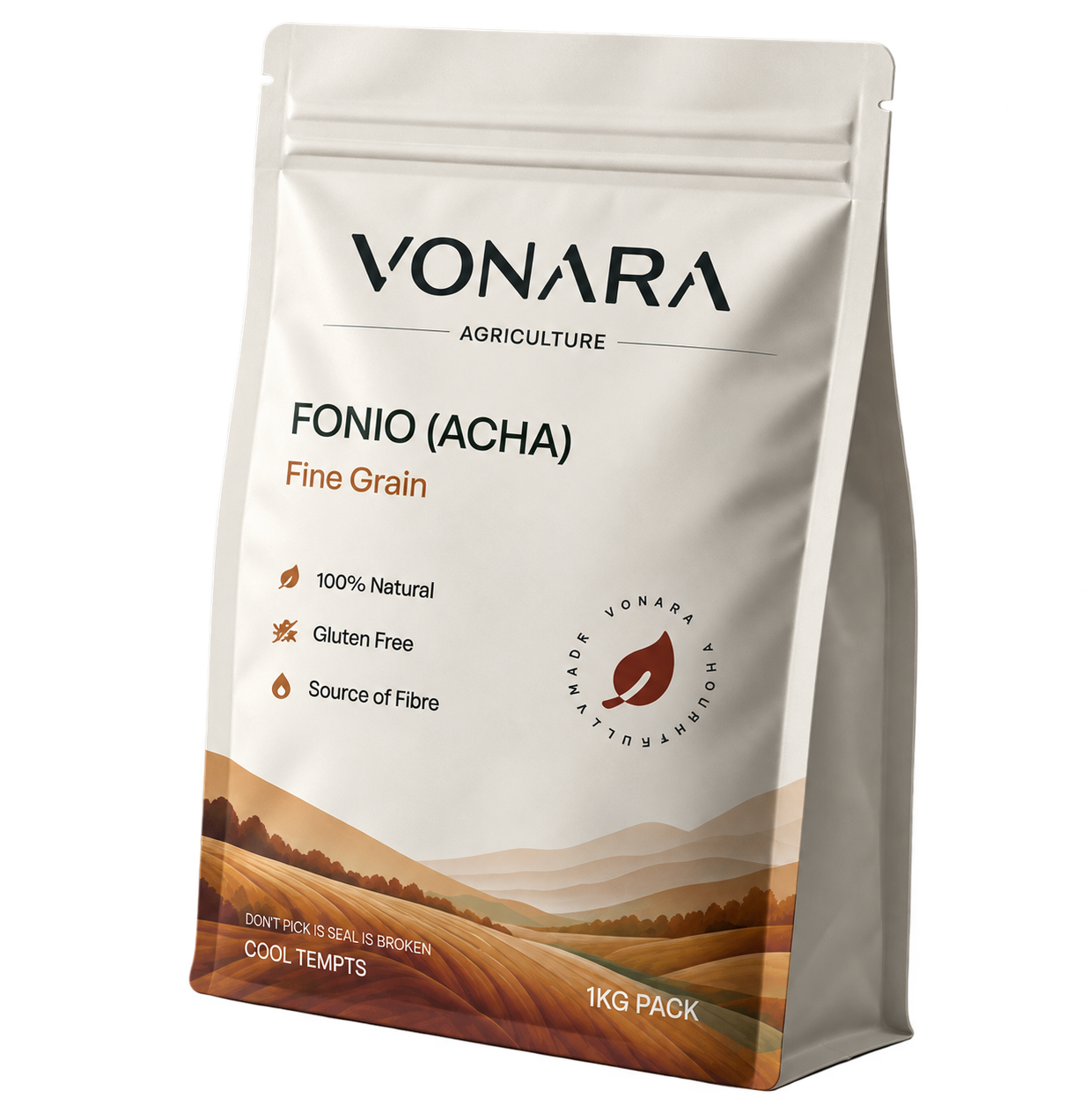
The packaging had to work first as a physical product.
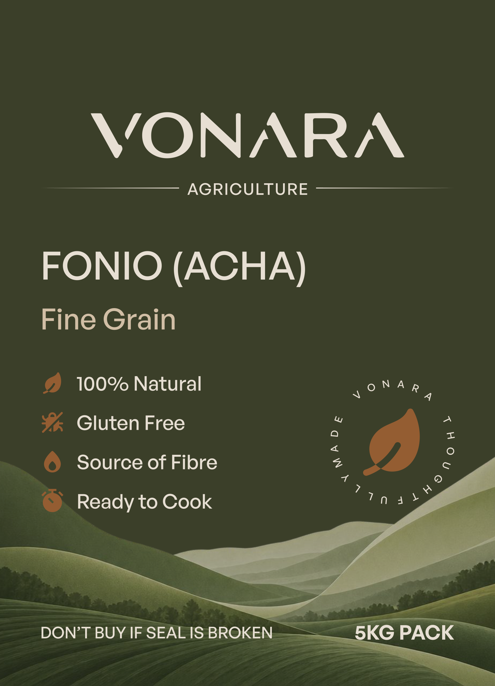
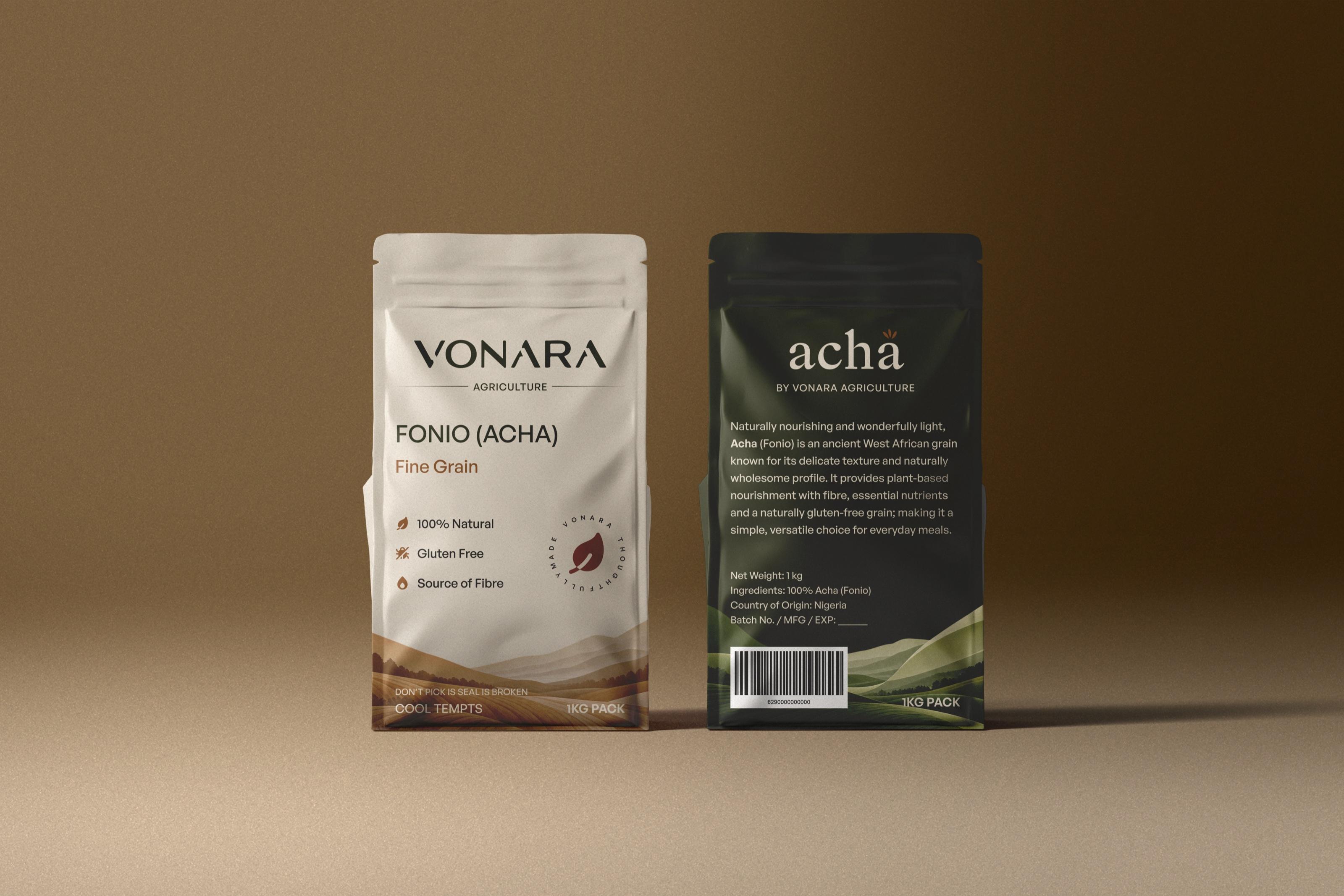
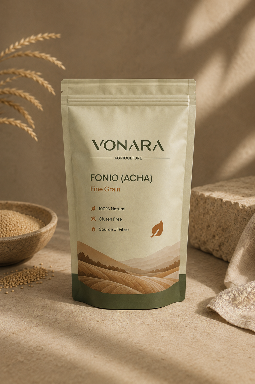
We designed the system across 1 kg, 2 kg and 5 kg pouches, balancing brand recognition, product information and practical requirements without allowing the front of the pack to become crowded.
- First product
- Acha (Fonio)
- Pouches
- 1 kg · 2 kg · 5 kg
Make the product clear at a glance
The Vonara identity establishes the maker while the product name and essential information remain easy to identify.
Supporting information such as 100% natural, gluten free, source of fibre and ready to cook was organised as secondary evidence rather than competing with the product itself.
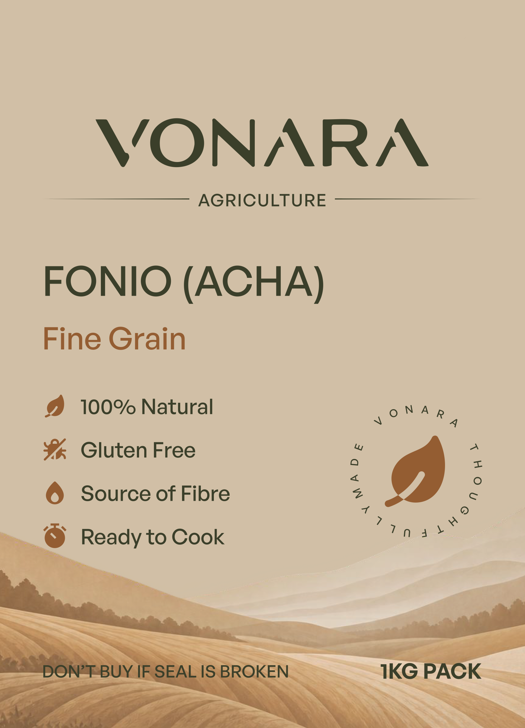
Treat the back as part of the experience
Nutritional information, preparation guidance, barcode requirements and product details needed considerably more information density.
We used hierarchy and spacing to make those requirements readable while maintaining the same visual character as the front.
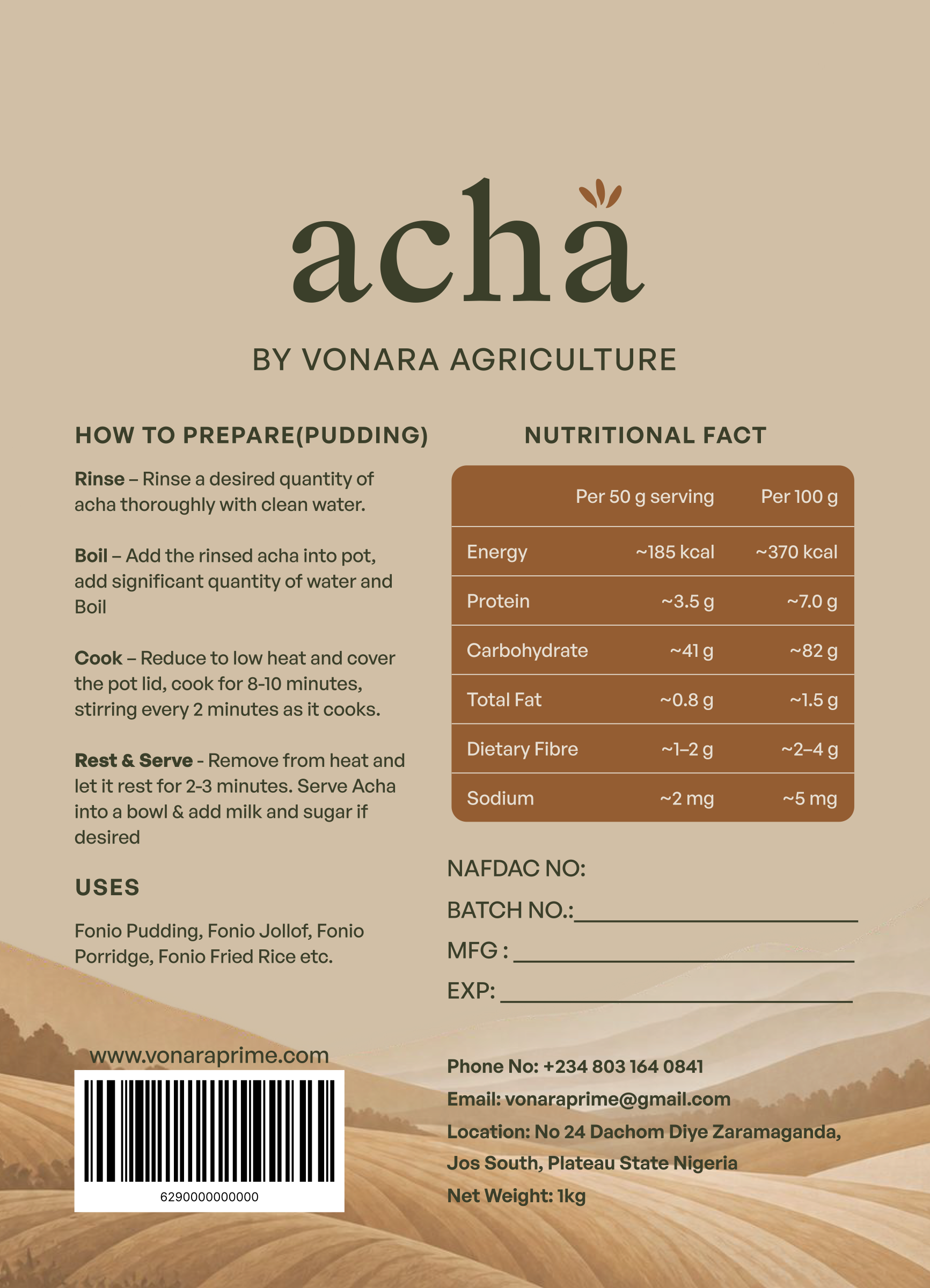
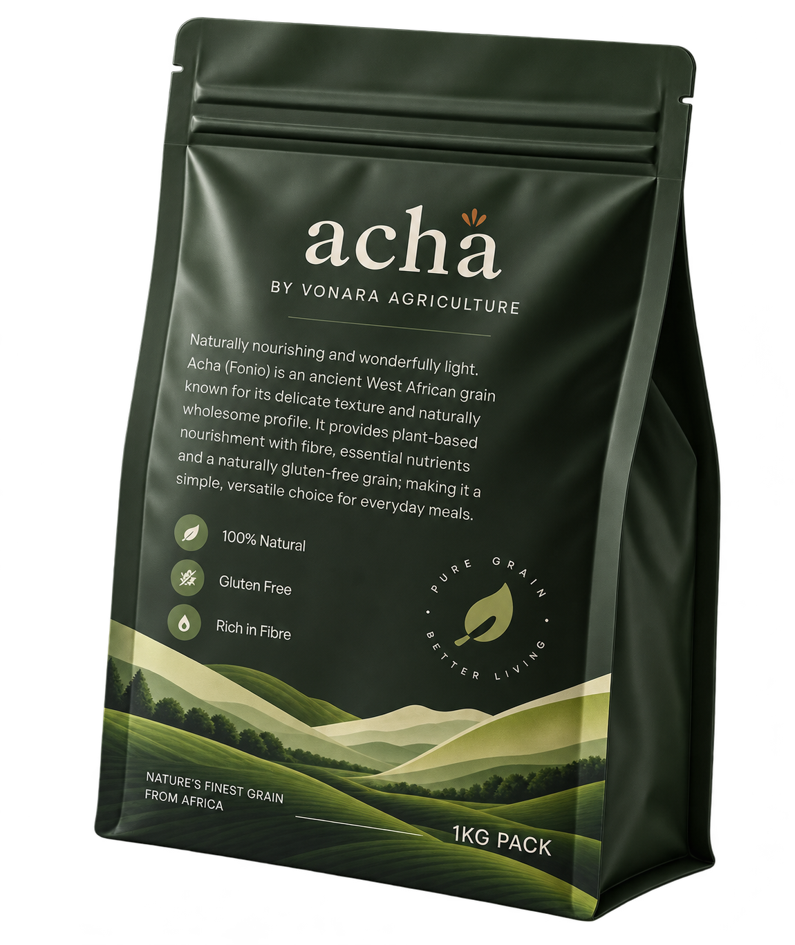
Build variation into the system
Light and green packaging directions explored how the product could retain recognition across different expressions without changing the underlying hierarchy.
05 / Art Direction
Showing What Acha Can Become
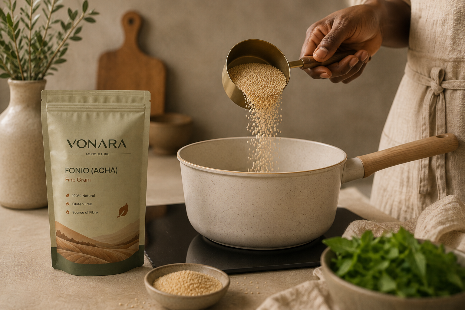
Packaging explains what the product is. Food imagery helps people imagine what they can do with it.
We developed an art direction around prepared dishes that moved Acha beyond the raw grain and into recognisable eating occasions.
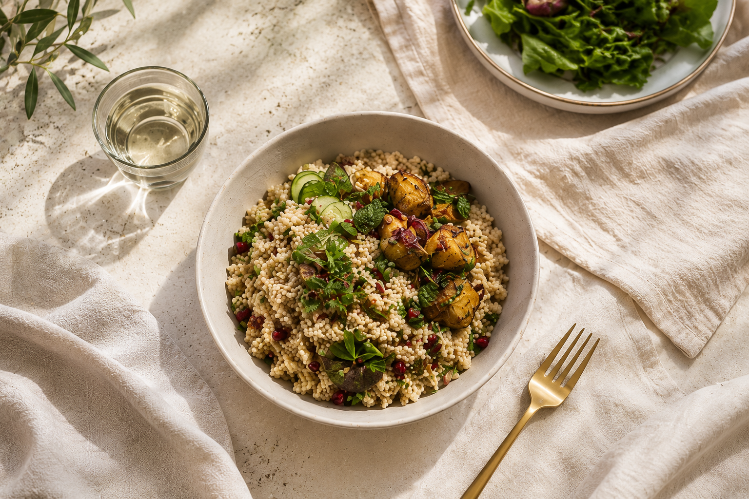
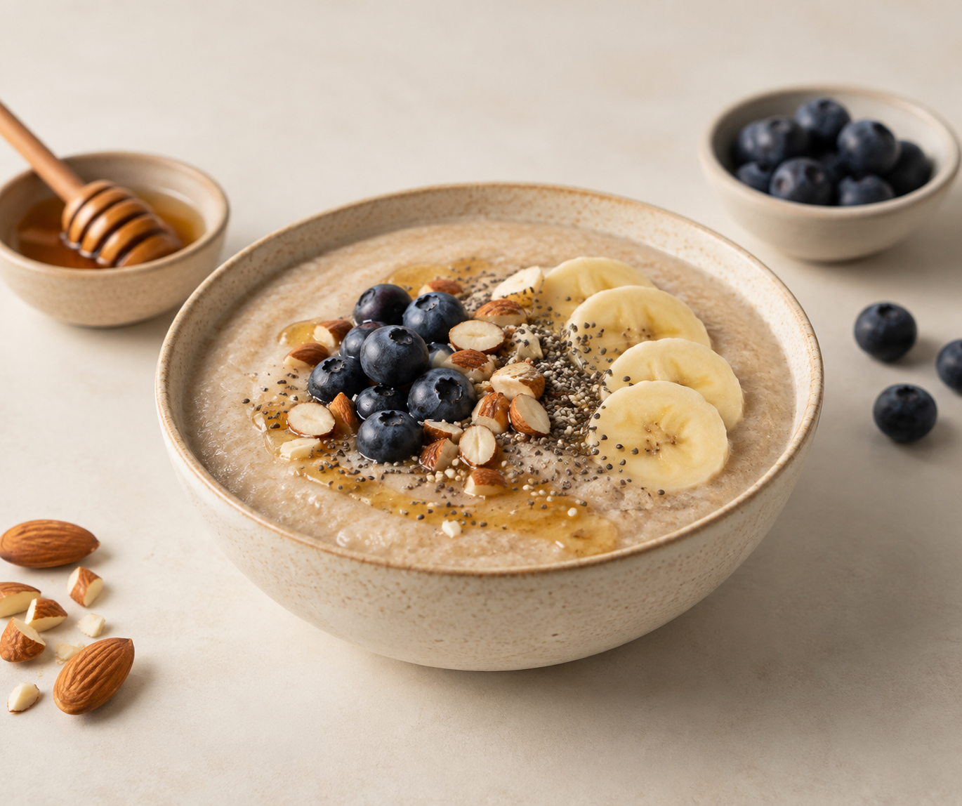
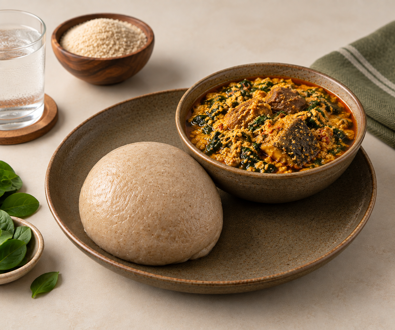
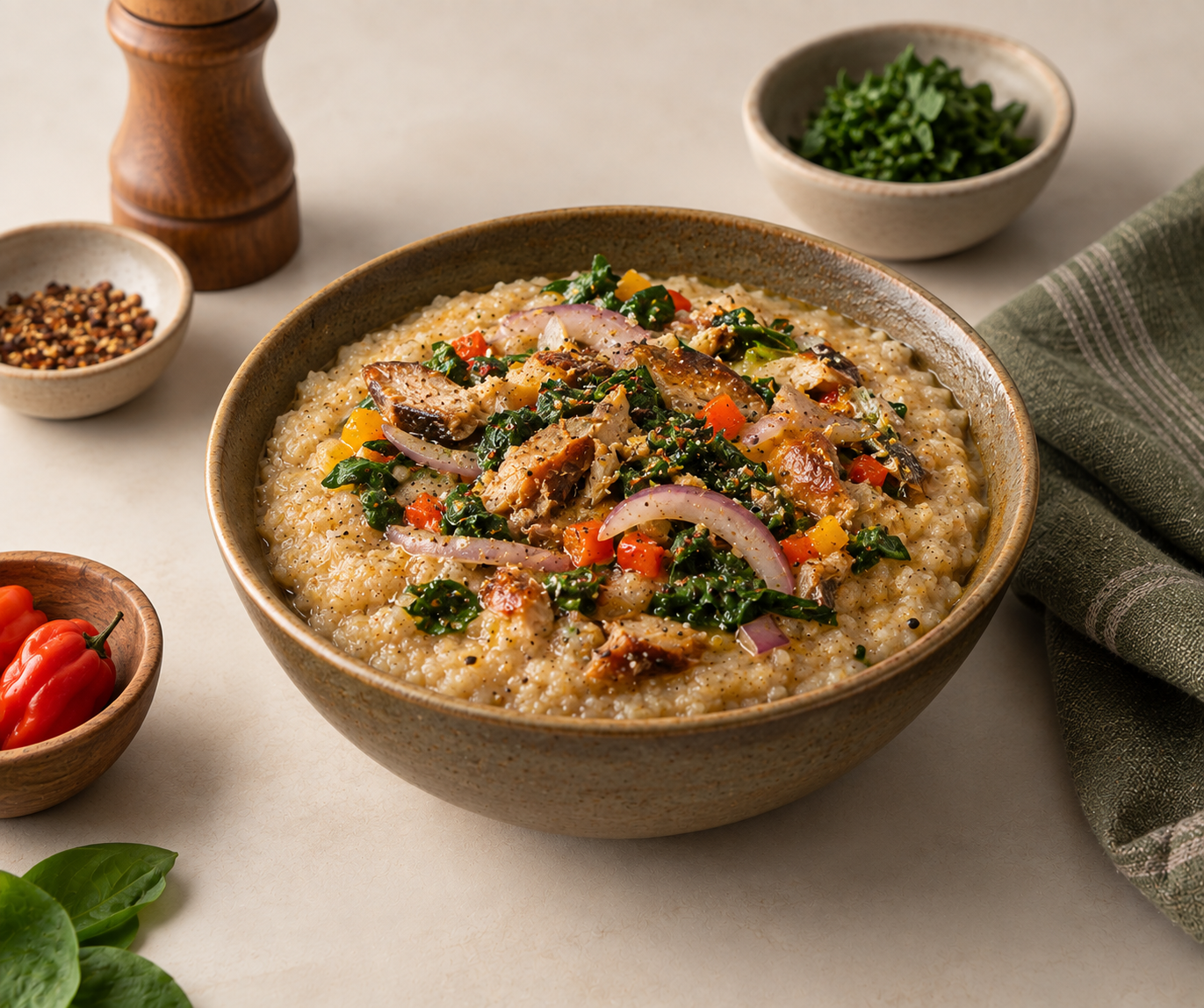
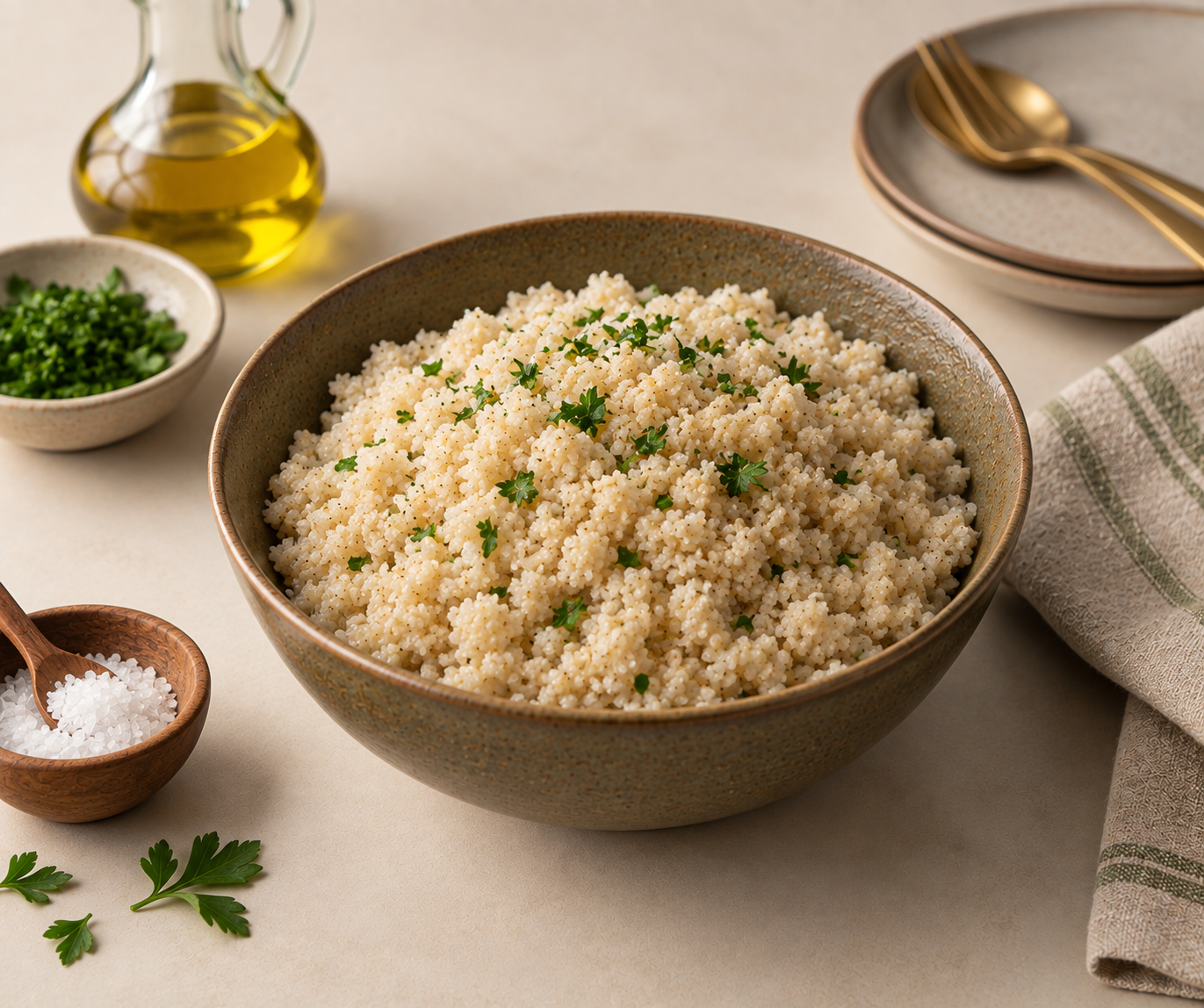
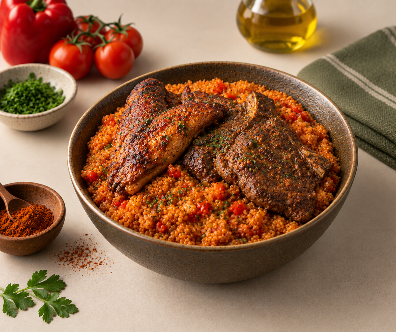
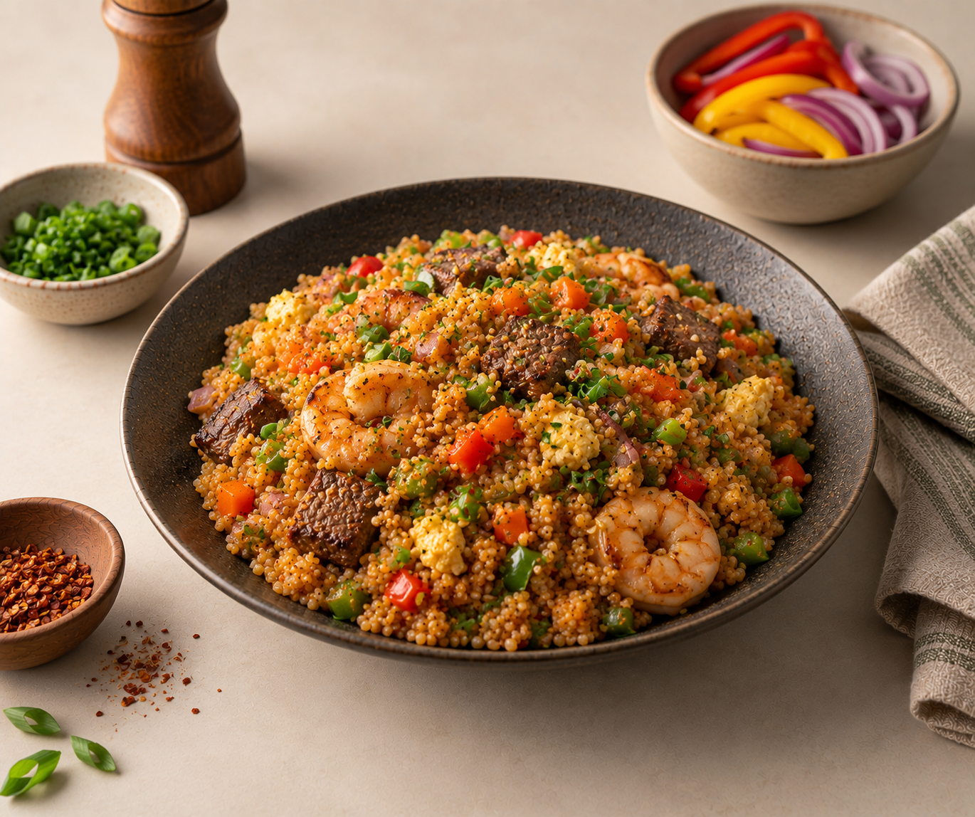
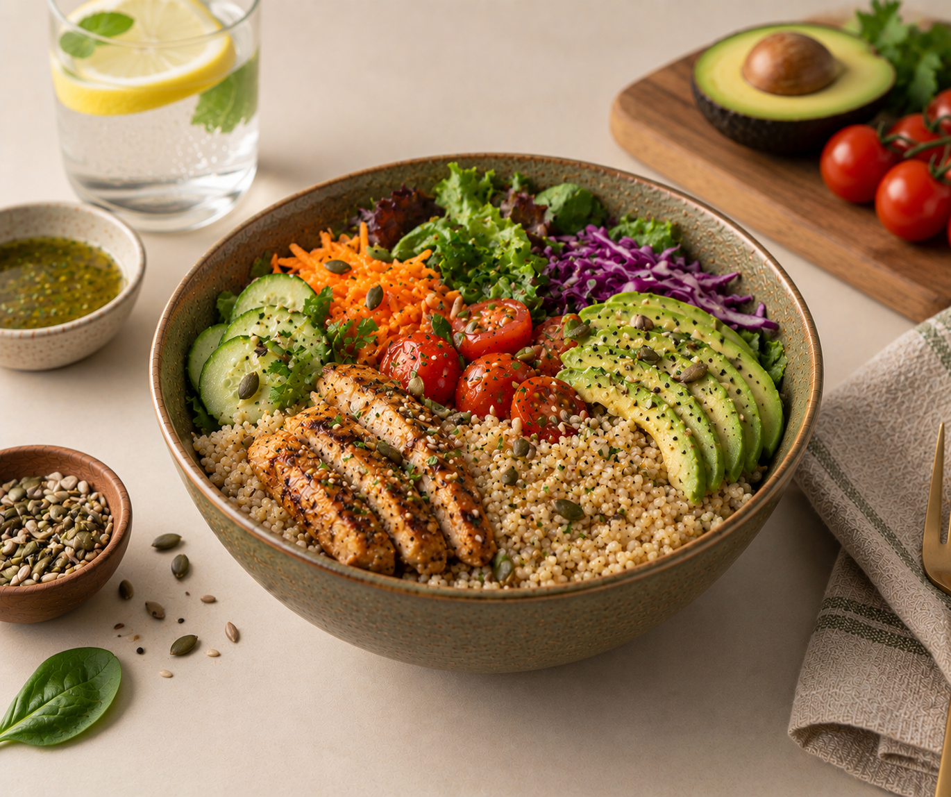
The variety helped communicate an important part of the product proposition visually: Acha isn't limited to one preparation or one type of meal.
- Breakfast
- Acha pudding.
- Traditional meals
- Tuwo-style swallow served with soup.
- Everyday dishes
- Porridge and plain fluffy Acha.
- Contemporary meals
- Jollof, fried Acha, salads and grain bowls.
06 / Digital
Digital Experience
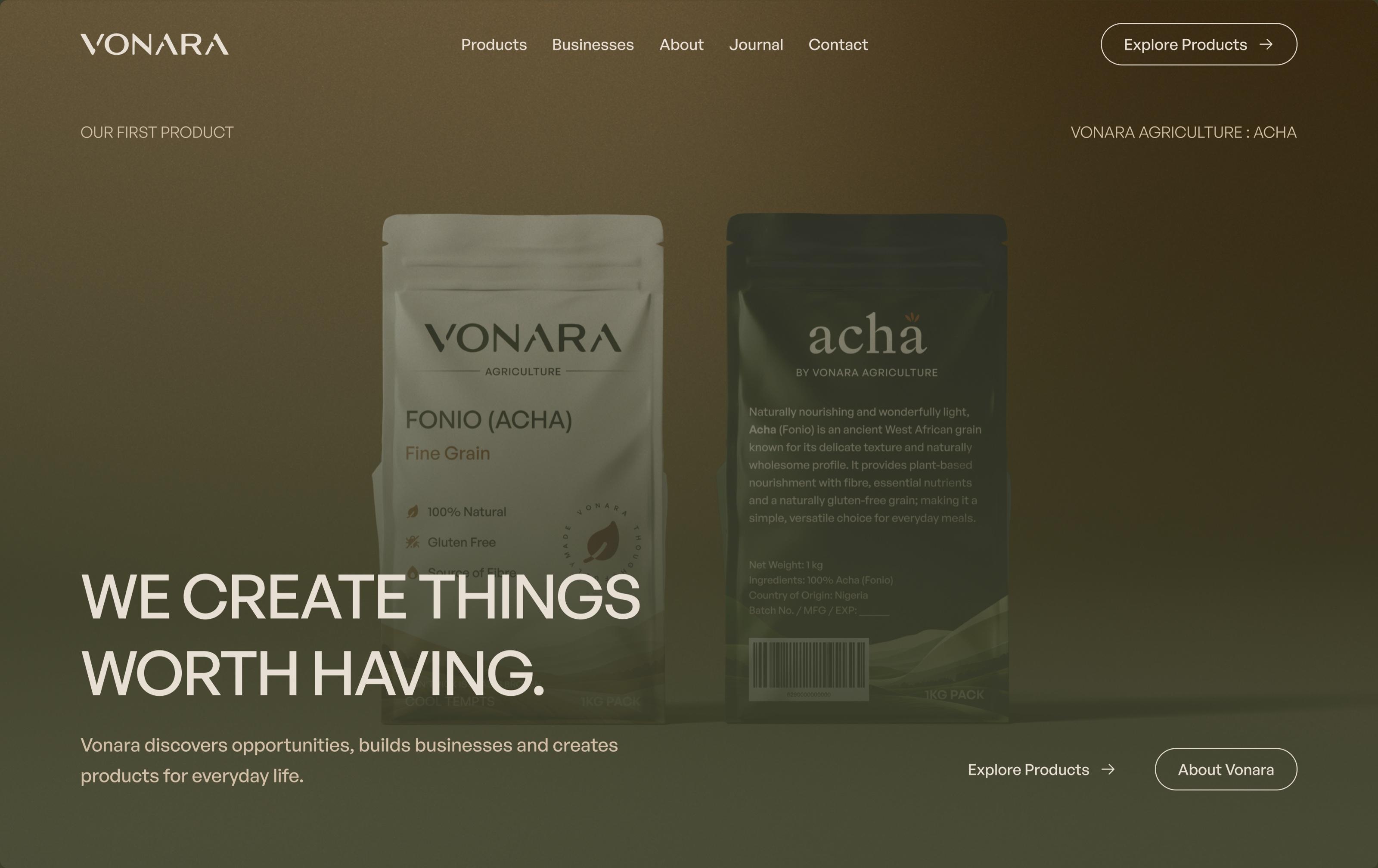
The website extends Vonara beyond the shelf.
Rather than treating it as an online brochure for one product, we designed the experience around the wider brand architecture while allowing Acha to remain the immediate focus.
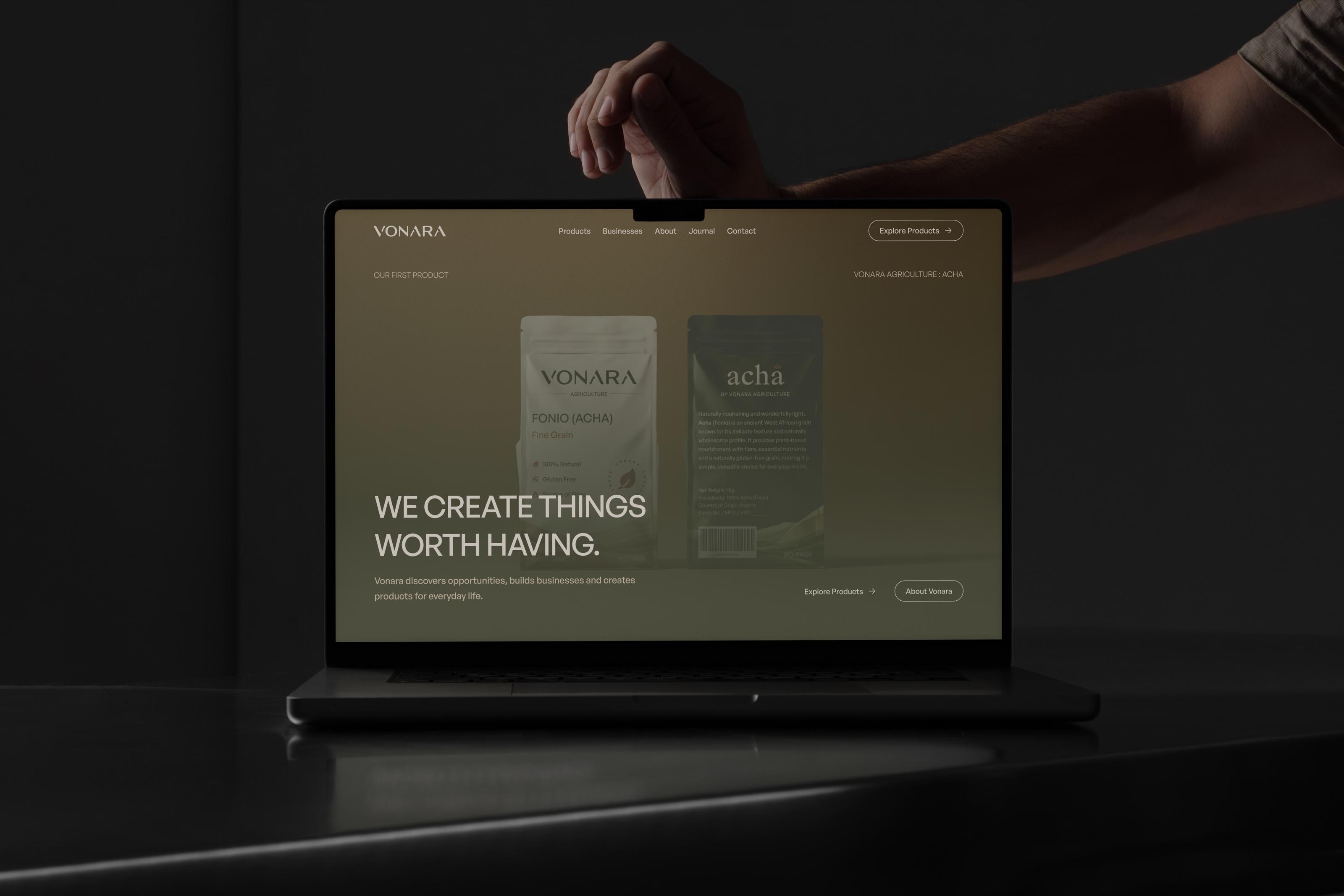
Product discovery
The product experience introduces Acha through its benefits, preparation, nutritional information and different ways it can be eaten.
From grain to table
The digital experience gives us room to tell stories packaging cannot carry comfortably, including the journey of Acha and the different ways it can become part of everyday food.
A structure that can grow
Products, Businesses and Journal were separated within the information architecture so future Vonara categories and products have somewhere to live without rebuilding the site around them.
07 / Foundation
Building the Digital Foundation
We developed the website as a responsive experience with a content structure designed to keep Vonara's product and editorial material manageable as the brand grows.
Sanity provides the content layer for product information, journal entries, imagery and media, allowing new material to be published without restructuring the frontend.
The result is a digital system that can expand alongside the brand rather than remaining fixed around its first launch.
08 / Outcome
Outcome
Final artifacts
The engagement established Vonara across its first physical and digital touchpoints.
- Identity
- Wordmark, symbol, typography, colour and visual language.
- Packaging
- Acha pouch system across multiple sizes and visual variants.
- Art Direction
- Product imagery, prepared dishes and consumer-facing visual compositions.
- Digital
- Responsive website, product experience, business architecture and journal.
- Content System
- A flexible CMS foundation for products, editorial content, imagery and media.
What happened
Vonara launched with a defined identity, its first packaged product and a live digital presence.
More importantly, those outputs were built around the wider business rather than only its first release. Acha establishes the first expression of Vonara without becoming the definition of what the brand must always be.
The resulting system gives future products and categories a recognisable foundation to build from.
Reflections
Vonara reminded us that designing for growth doesn't mean trying to design every possible future upfront.
The more useful decision was to establish what should remain recognisably Vonara, then give individual products enough room to develop their own expression within that system.
Acha gave us a real product through which to test that thinking across identity, packaging, imagery and digital experience.