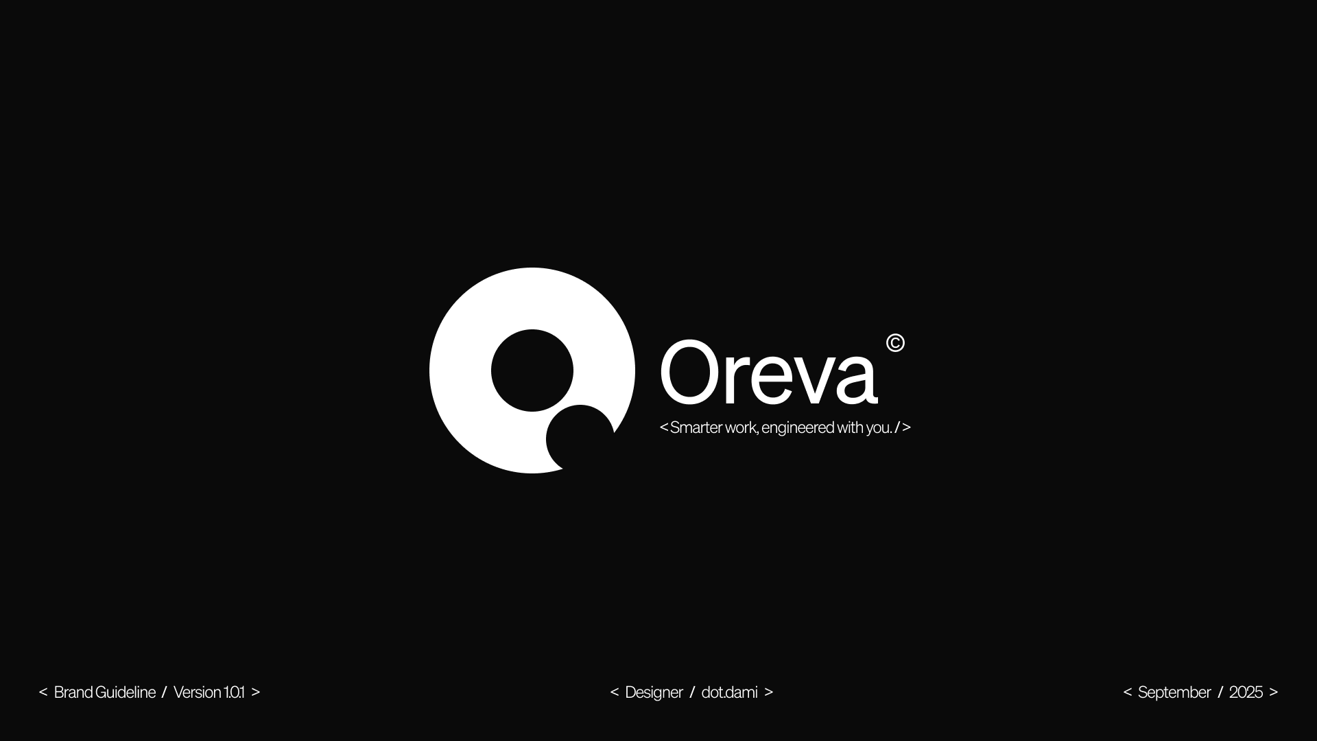
Oreva AI is an AI assistant designed for engineers, developers and technical professionals.
We were brought in to shape how the company presents itself: defining an identity that could feel at home around technical products and the people who build them, without relying on the visual conventions that have become common around AI.
The opportunity wasn't to make Oreva look intelligent. It was to build a recognisable identity around the role it wanted to play in its users' work.
01 / Brand Idea
Brand Idea
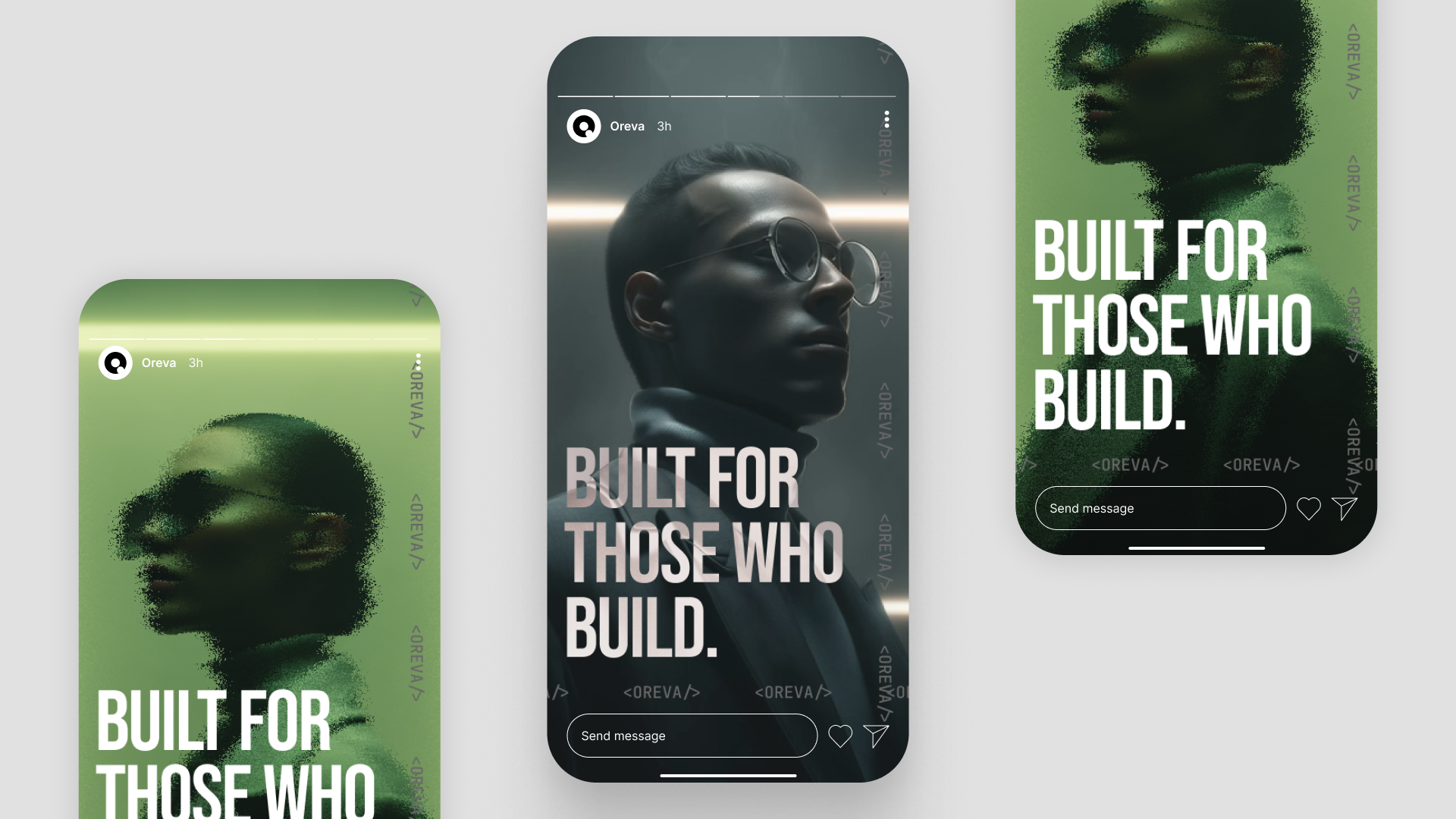
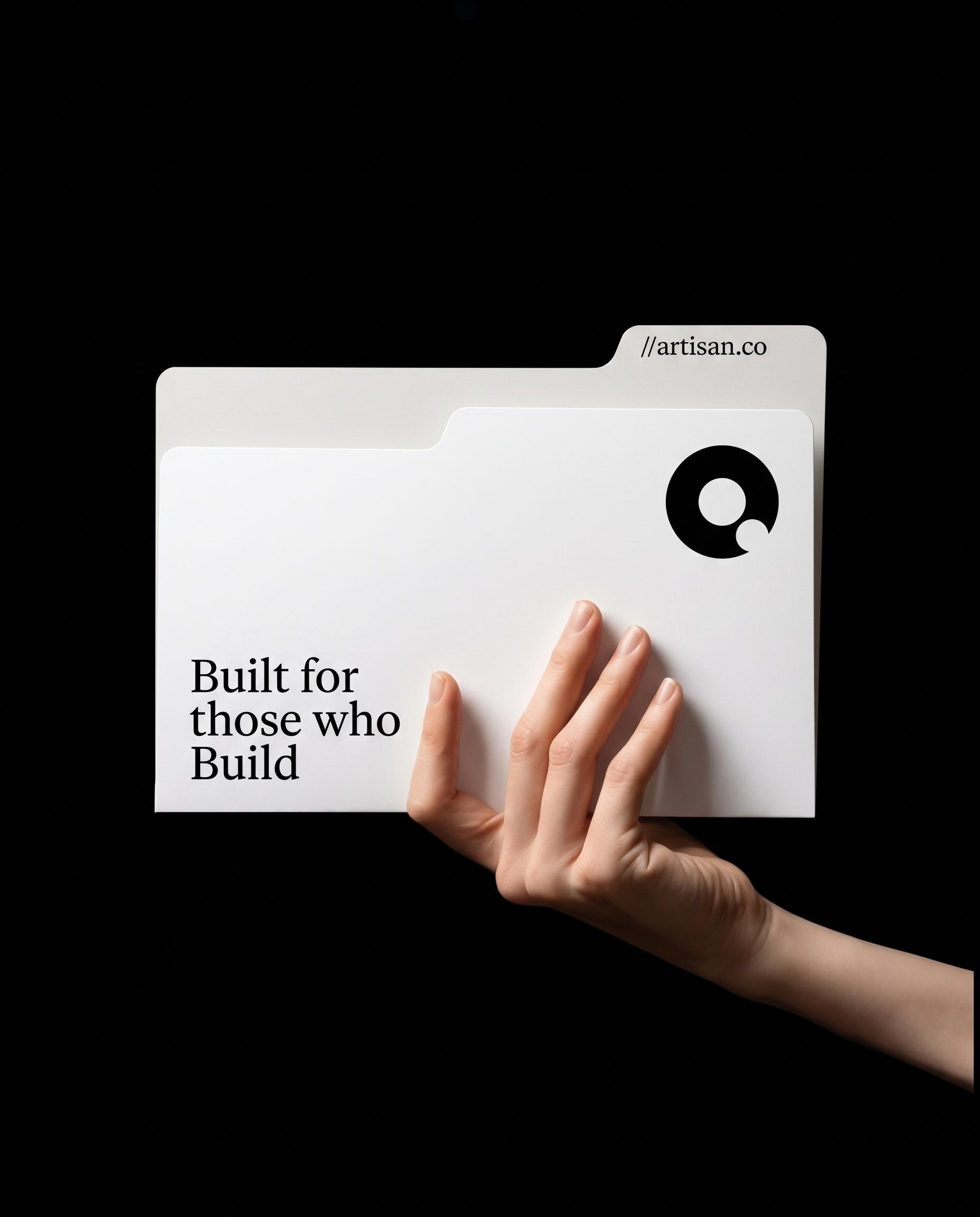
Built for those who build.
Oreva is designed to work alongside expertise, not perform intelligence in place of it.
That distinction gave us the central idea for the brand. Instead of building the identity around artificial intelligence itself, we looked at the people using it and the culture surrounding their work: systems, logic, structure, experimentation and precision.
Built for those who build became a simple expression of that relationship.
It positions Oreva as a tool for capable people rather than the protagonist of their work.
02 / Identity
Identity
A technical language without the usual clichés.
We wanted Oreva to feel familiar within a technical environment without turning the identity into an imitation of a code editor.
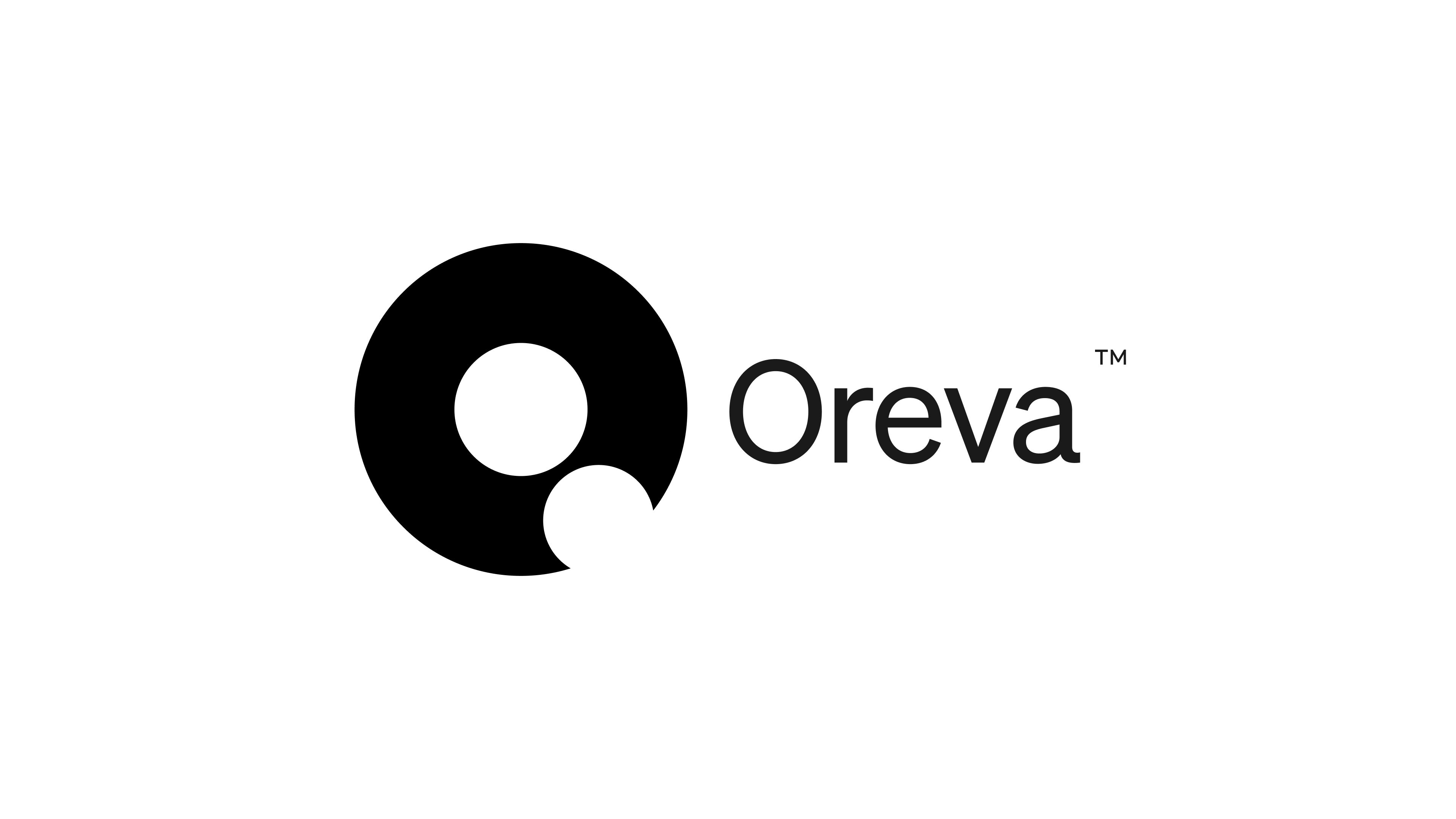
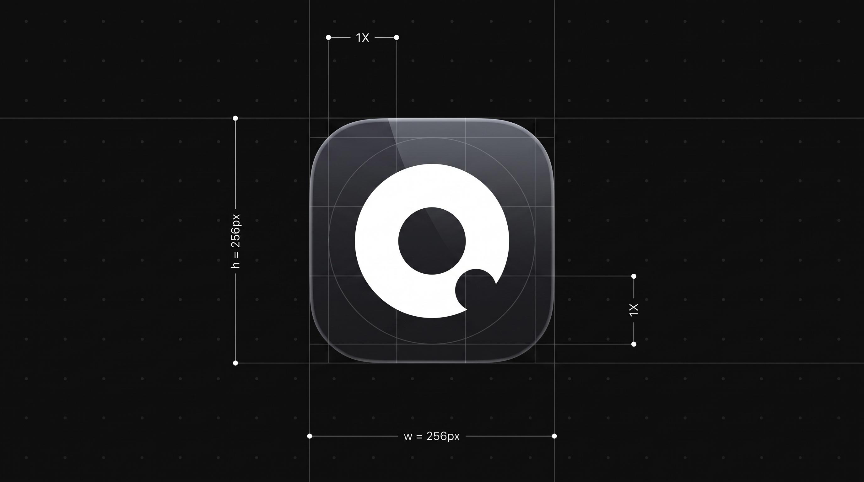
The wordmark and symbol establish the core recognition system, supported by typography, a restrained neutral foundation and more expressive colour when the identity needs energy.
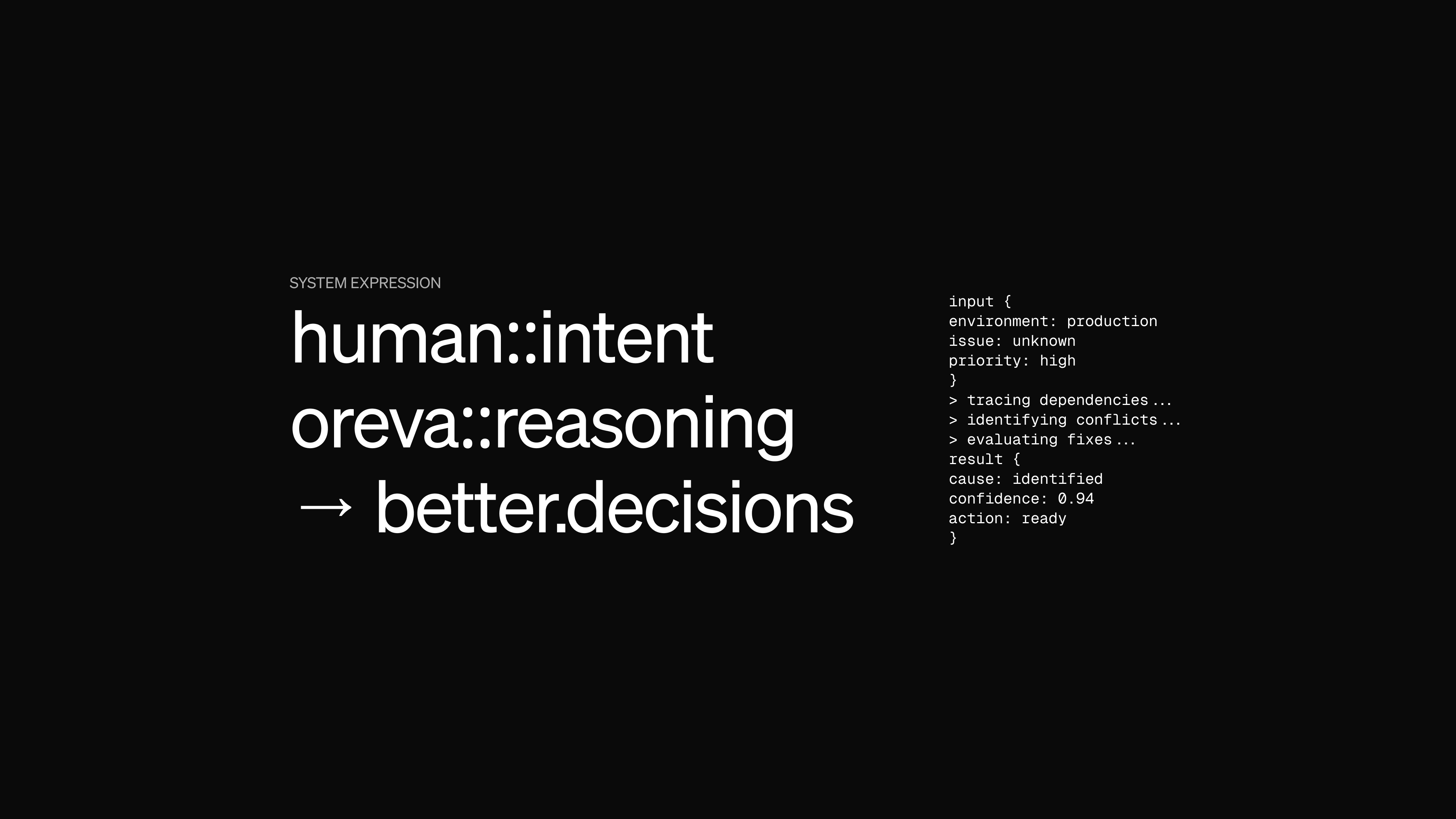
References to syntax, structure and flow appear throughout the wider visual language, but they remain supporting elements rather than decoration for its own sake.
Typography
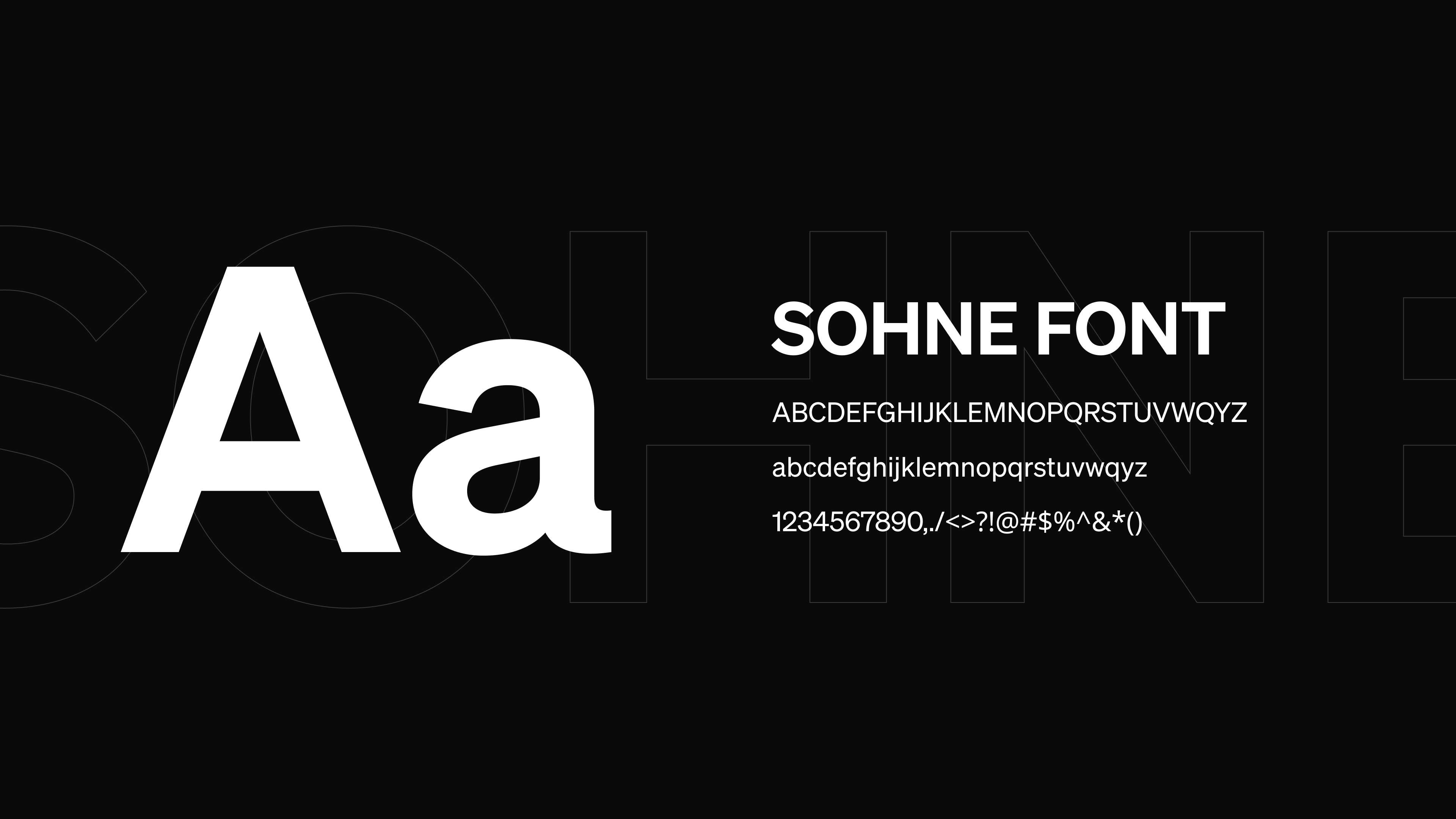
The typography keeps the system direct and functional, with enough character to move between product communication, technical information and larger brand statements.
Colour
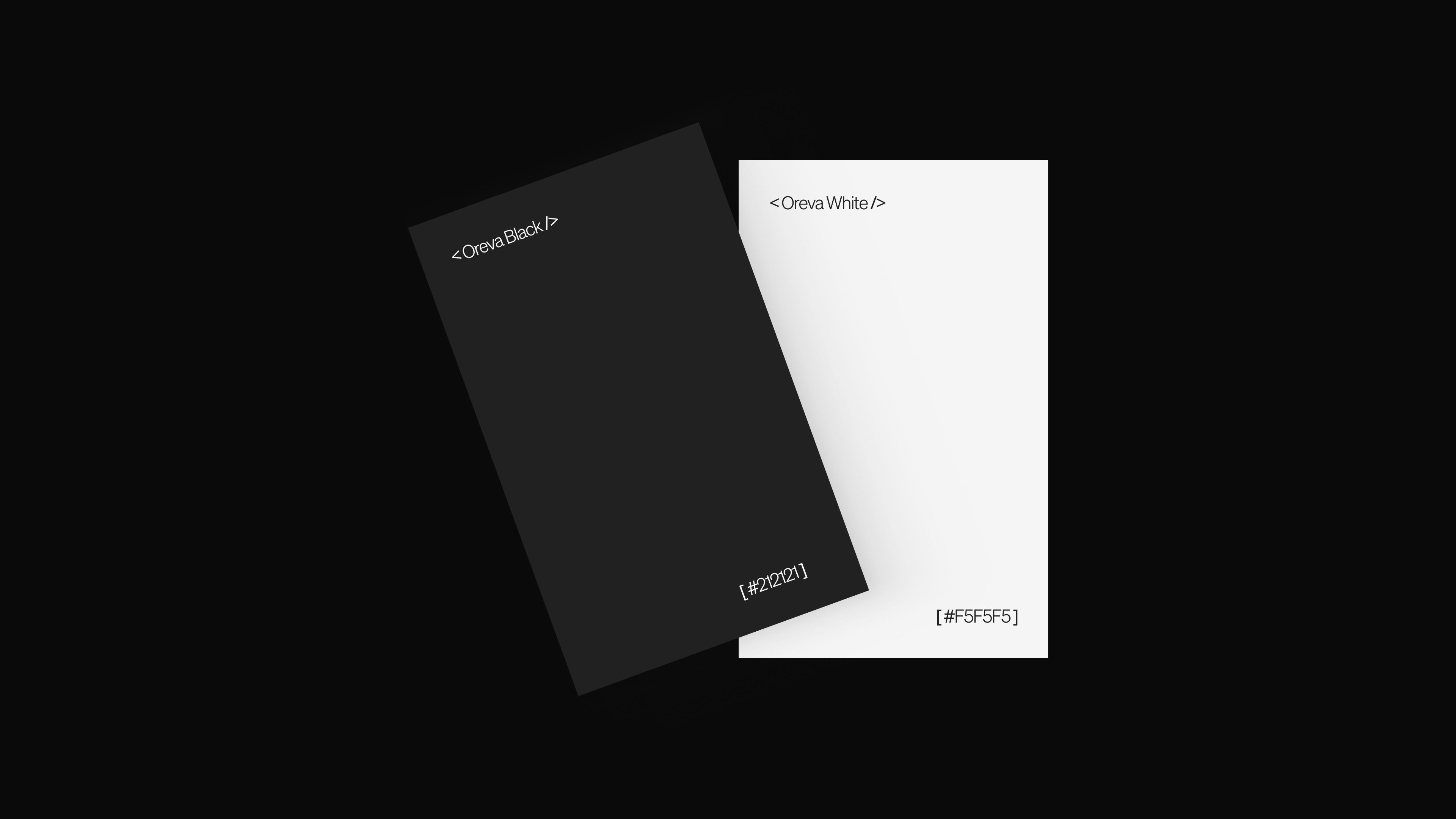
Black and white provide the foundation. Brighter colour introduces expression where the brand needs to become more visible without overwhelming the information around it.
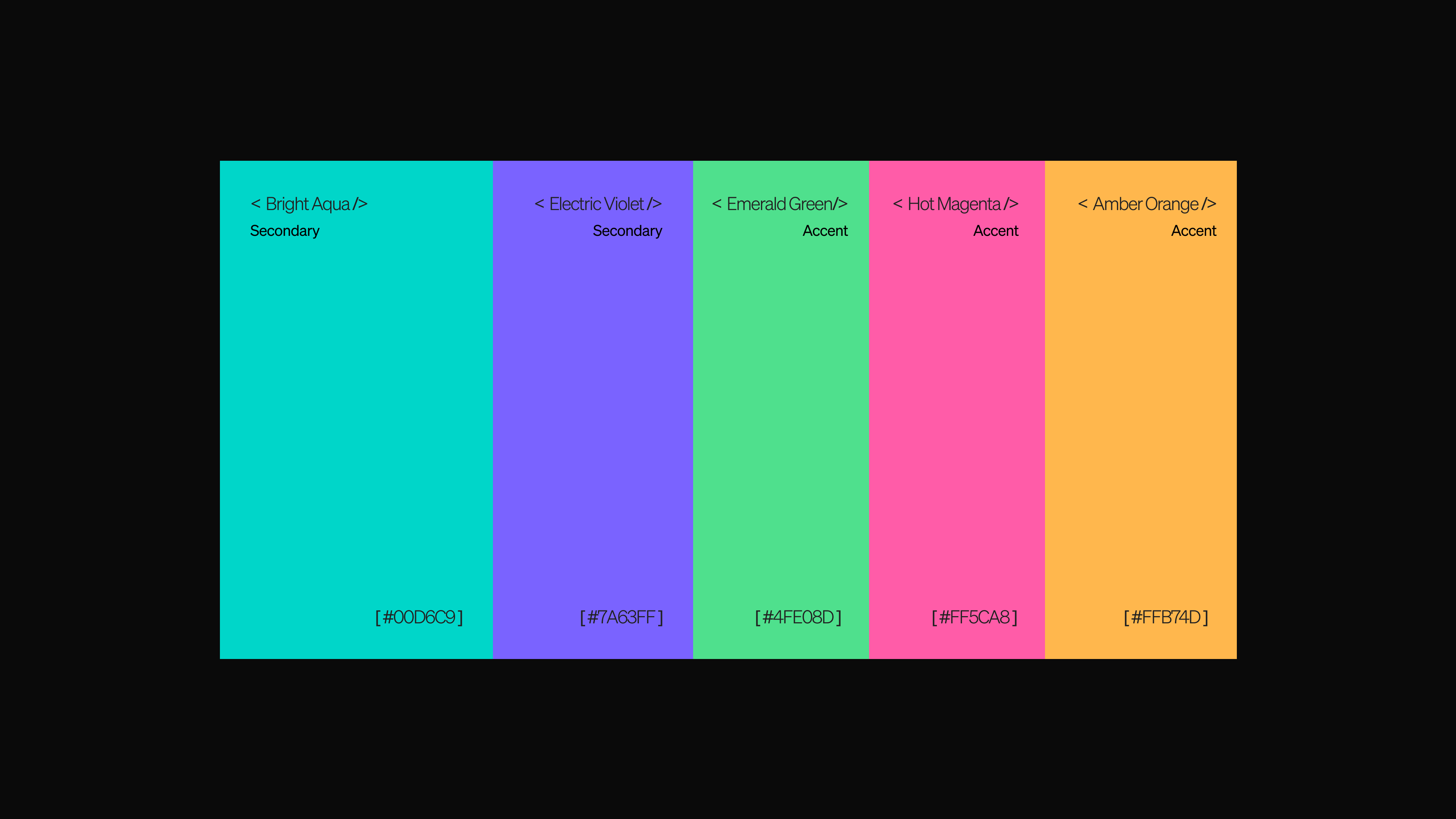
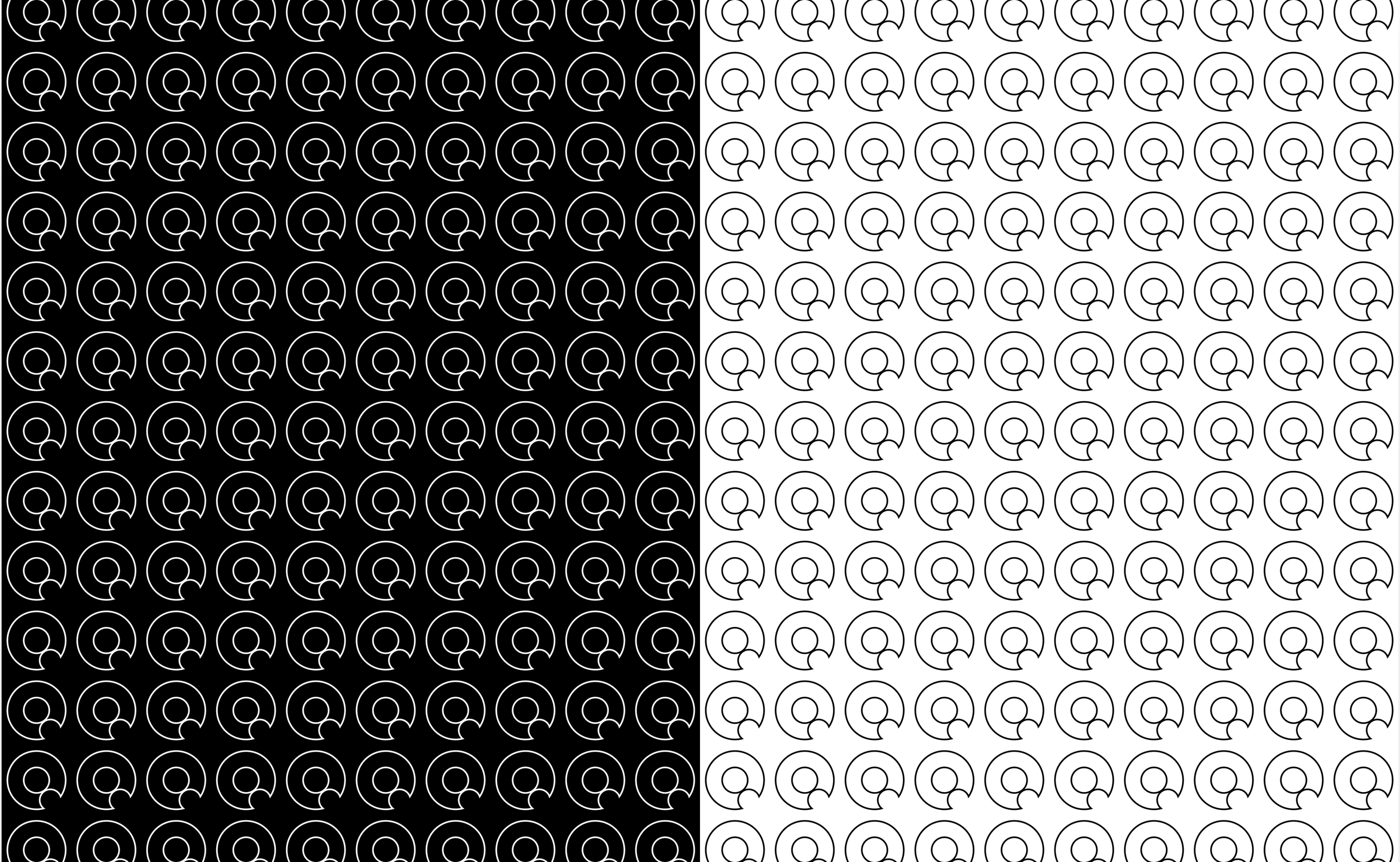
Patterns & syntax
The identity extends through patterns and small references to technical syntax, giving Oreva ways to build recognisable compositions beyond placing the logo everywhere.
03 / Applications
Applications
Giving the system somewhere to live.
The identity was designed to change scale without losing its character.
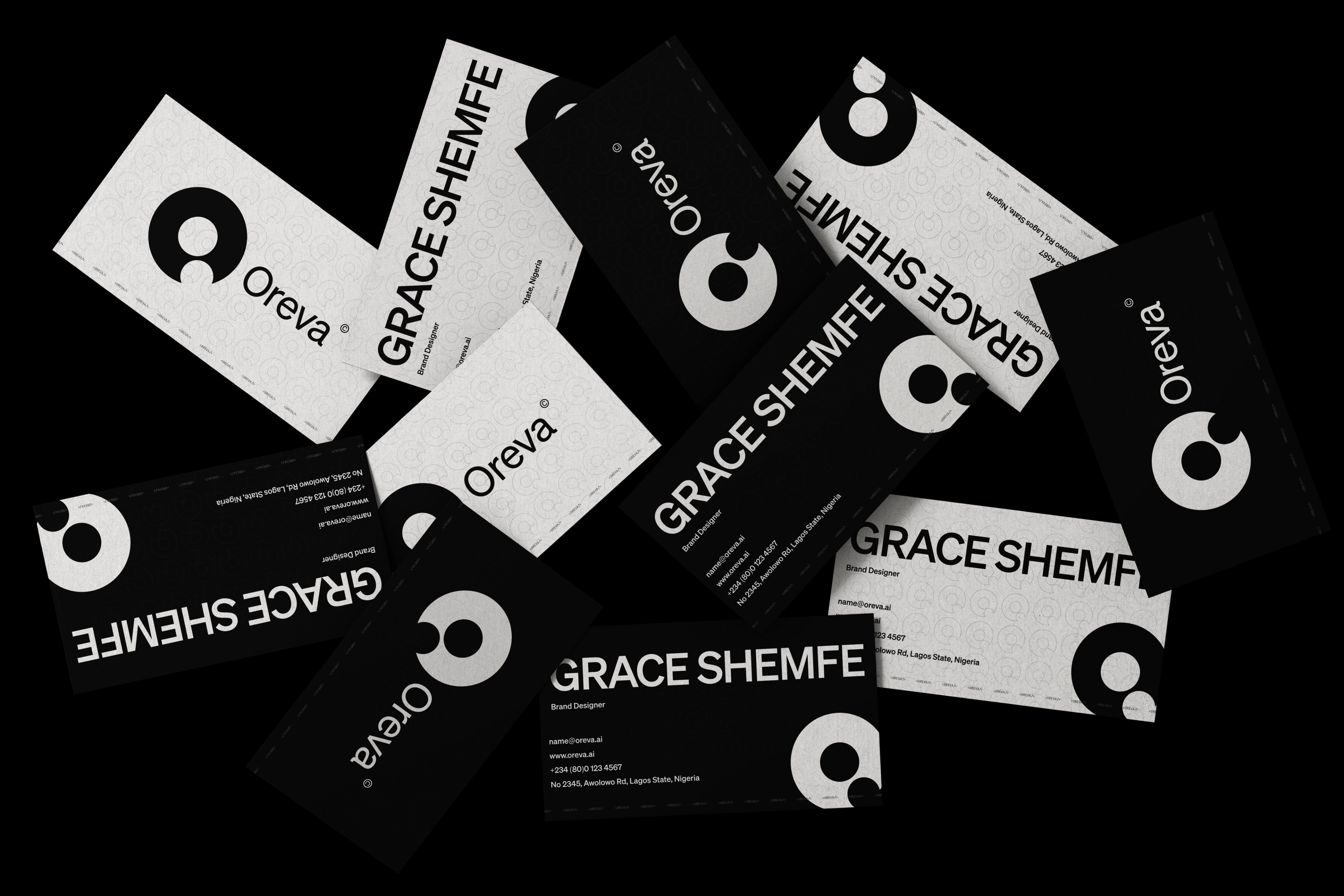
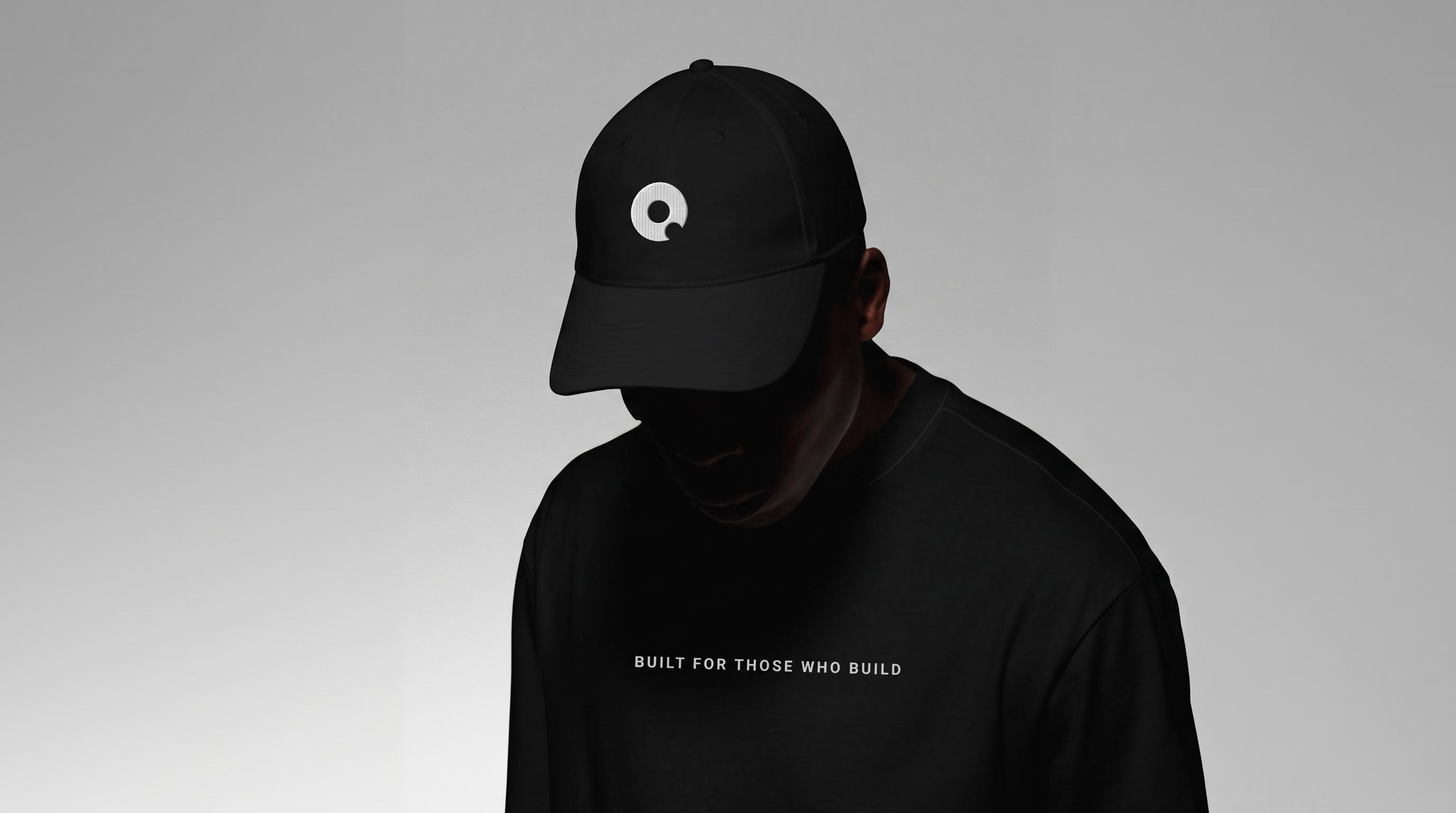
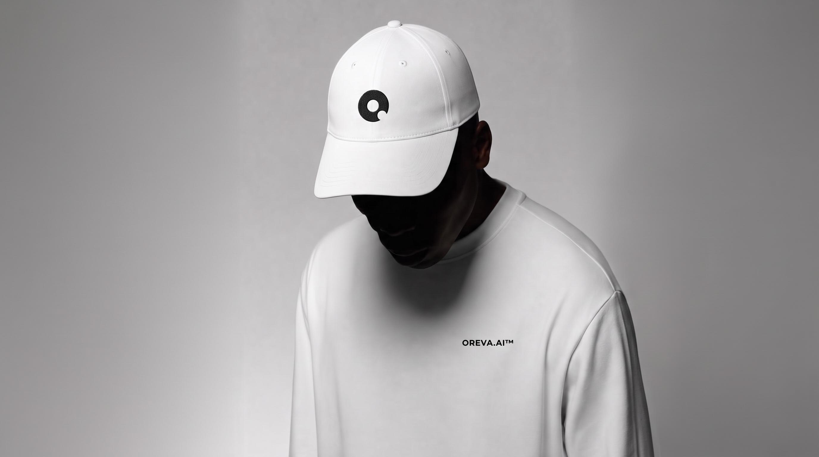
The full system can become expressive across campaigns and larger compositions, while the symbol, typography and simpler brand elements carry recognition in smaller applications.
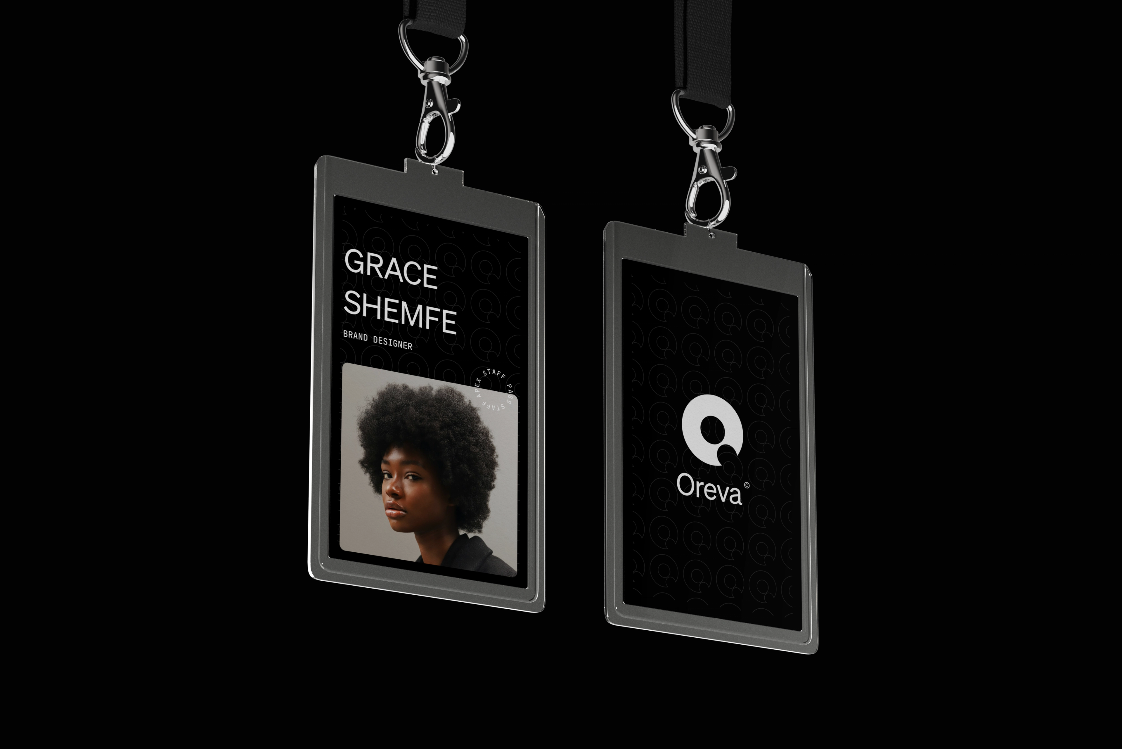
That gave us a flexible language for credentials, merchandise, social communication and other everyday brand touchpoints.
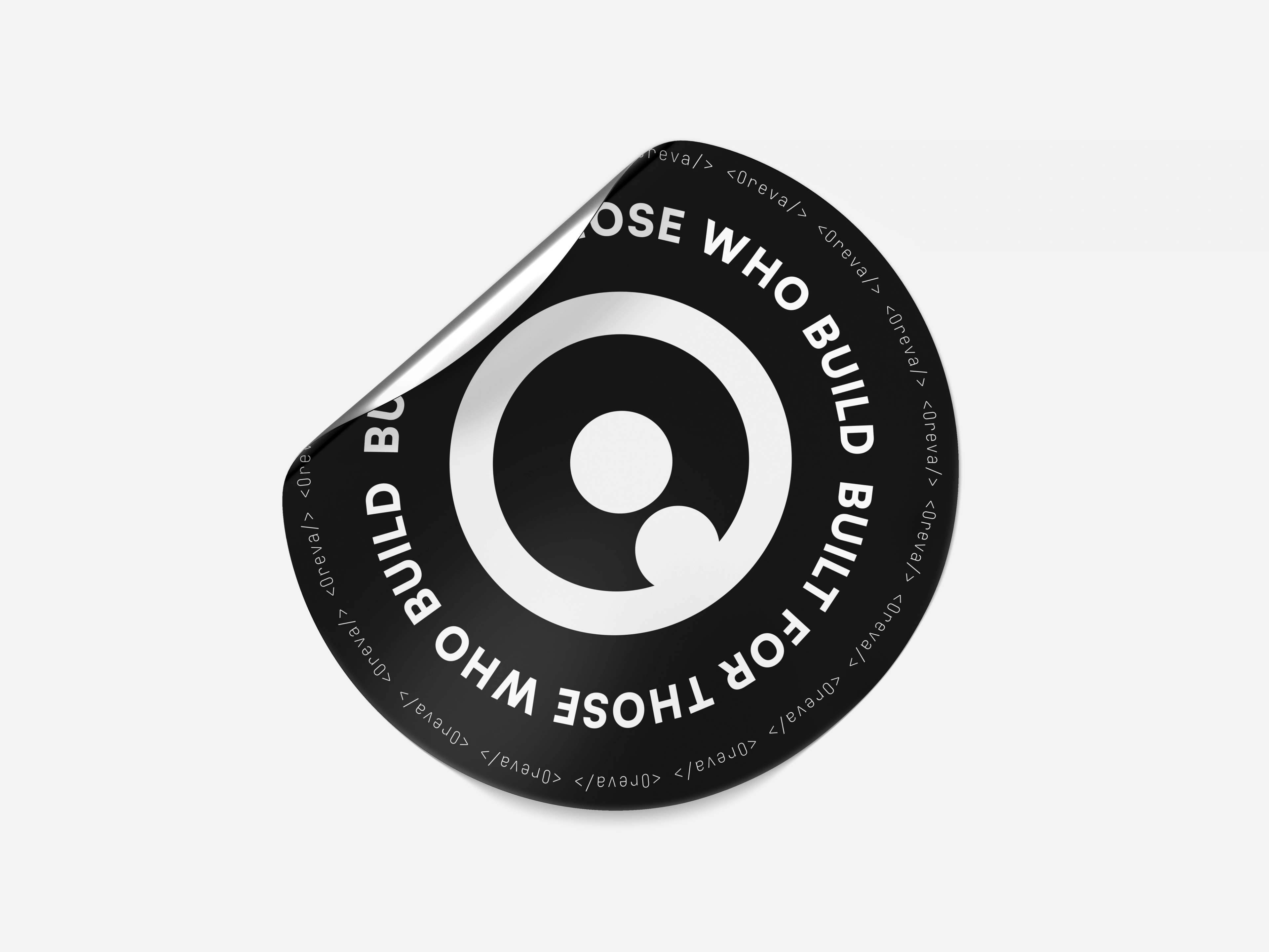
An identity that moves.
Motion gave us another way to express the logic behind Oreva.
Rather than adding movement as decoration, the identity can assemble, shift and transition through the same ideas of structure and flow that informed the static system.
04 / Digital
Digital
Built to exist around the product.
Oreva's identity needed to remain recognisable in digital environments where the brand shouldn't compete with the work itself.
We kept the system capable of becoming quiet when necessary. The neutral foundation, typography, symbol and controlled use of colour allow Oreva to retain its character across digital touchpoints without turning every interaction into a brand moment.
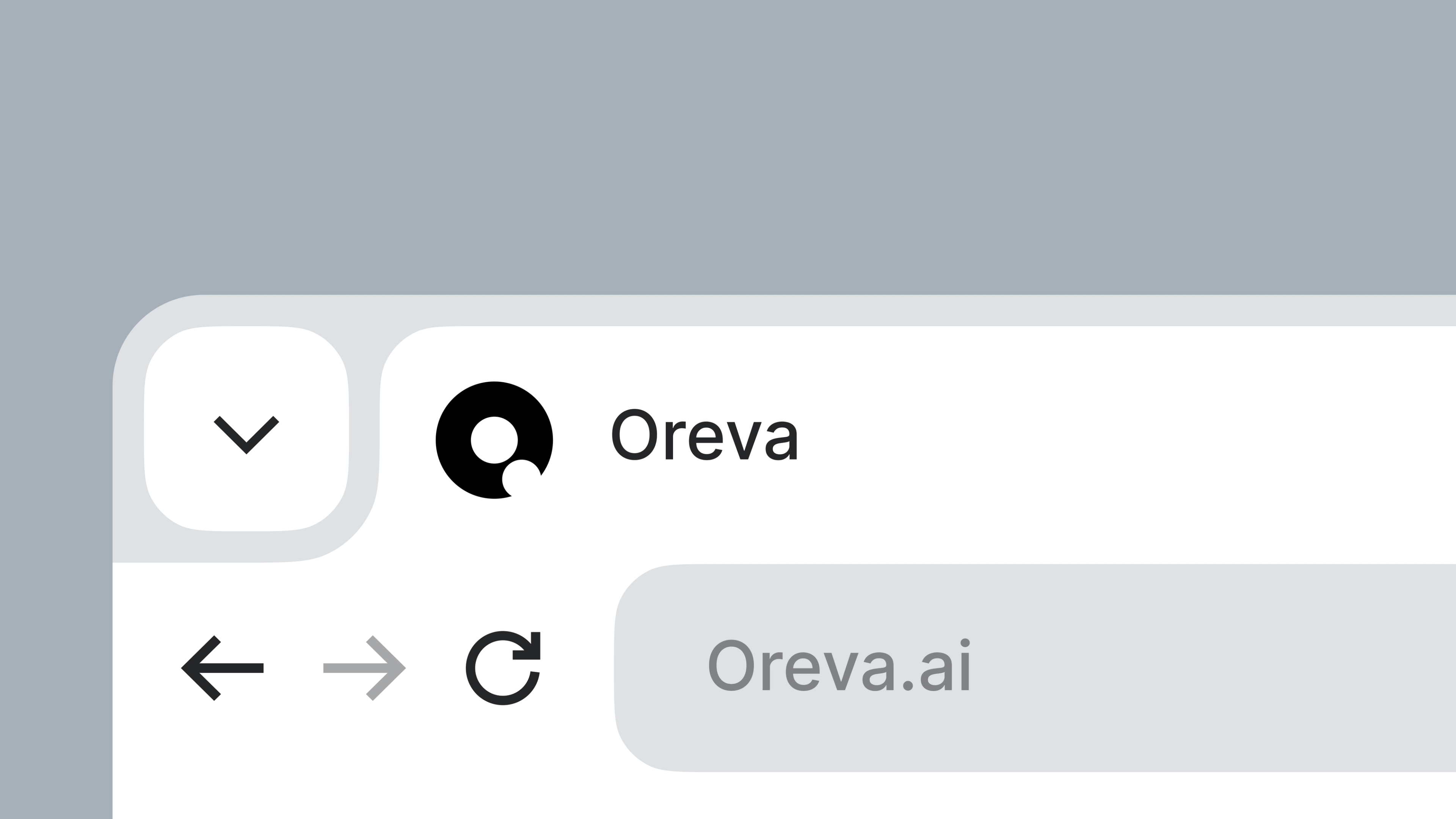
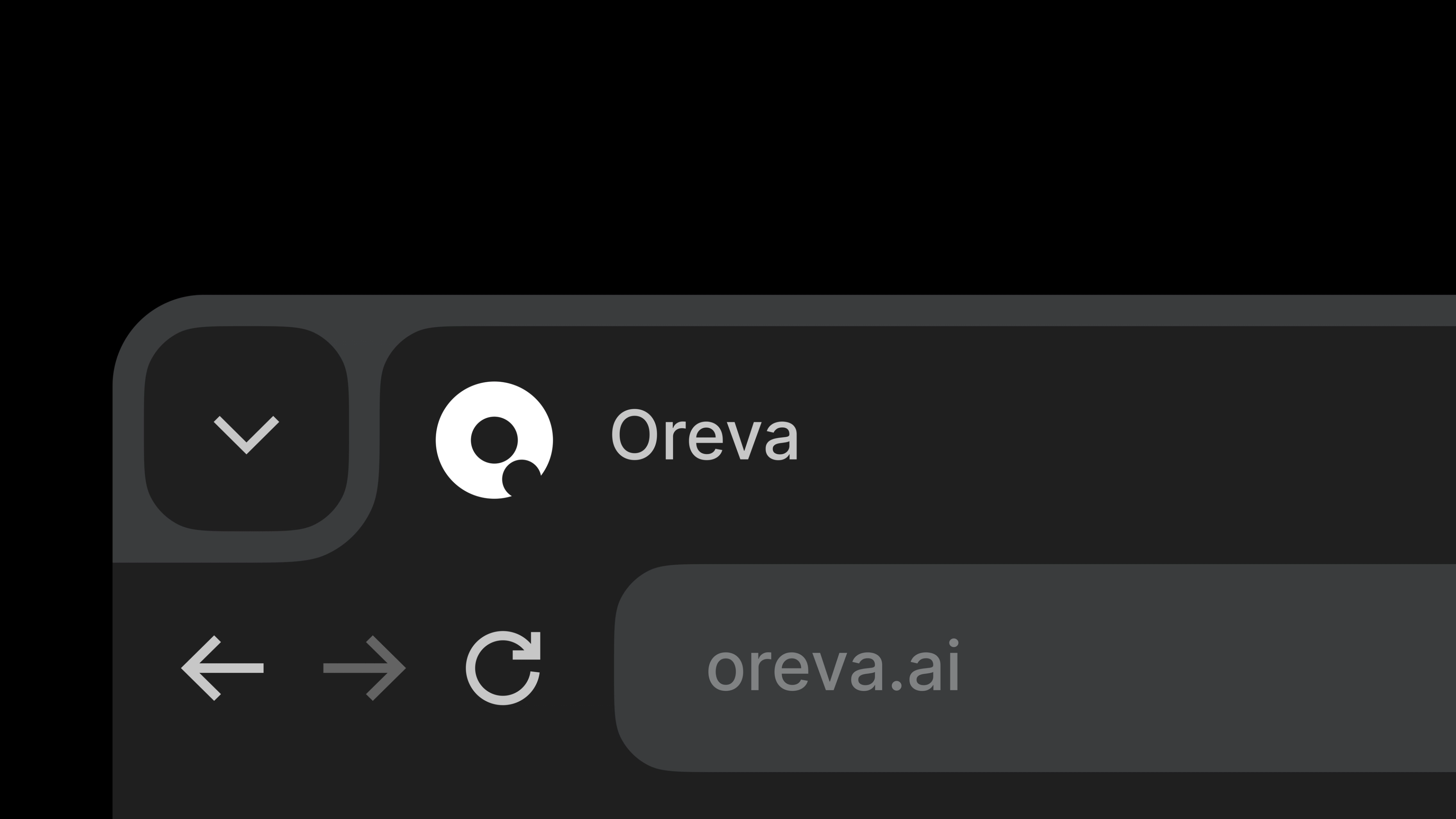
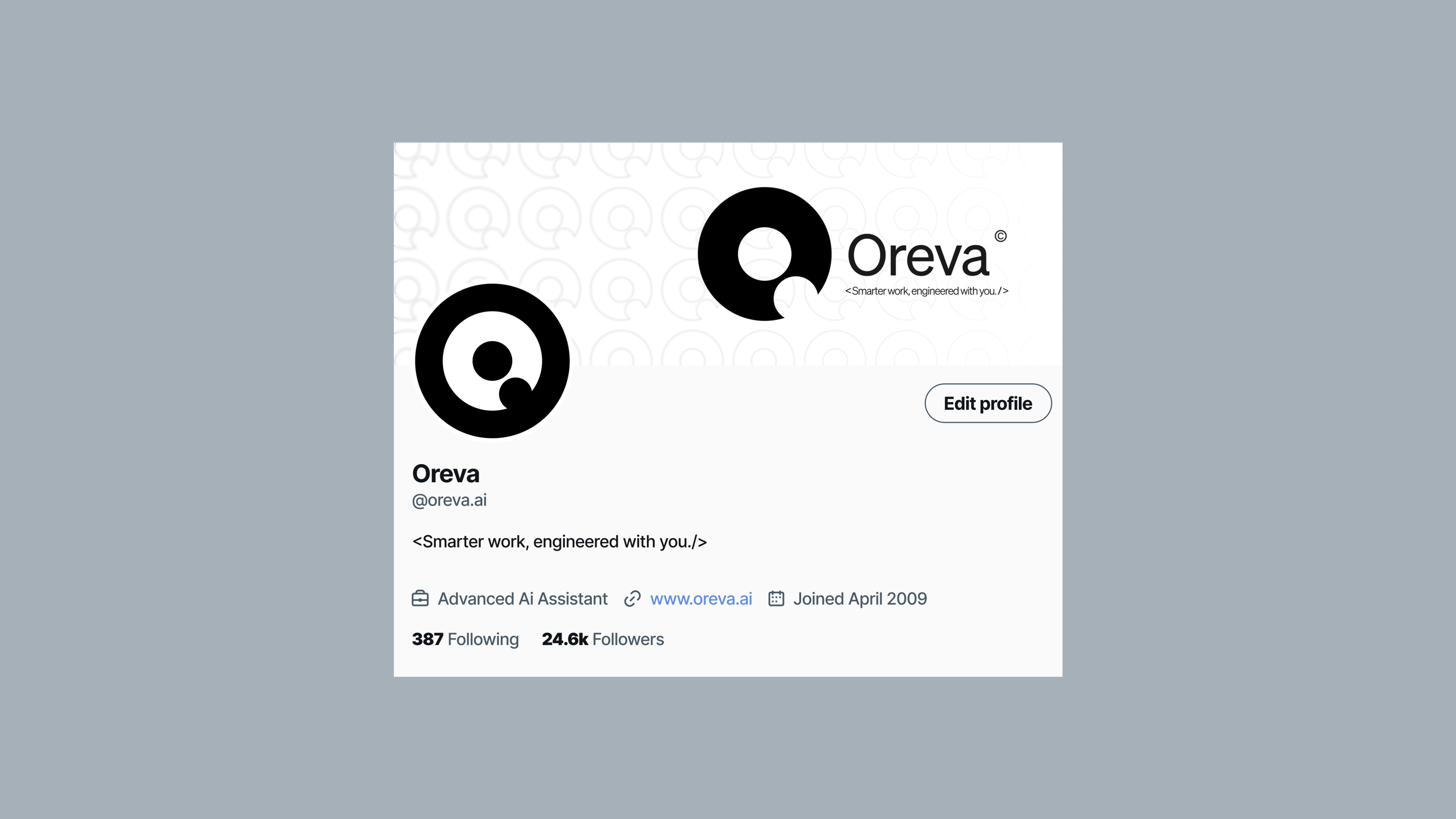
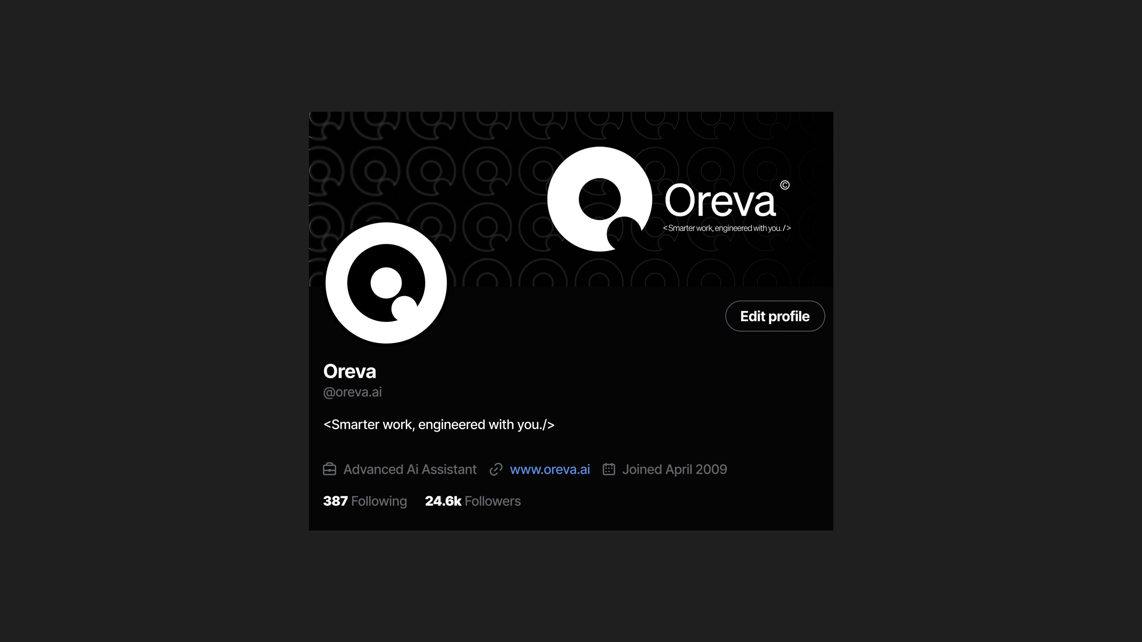
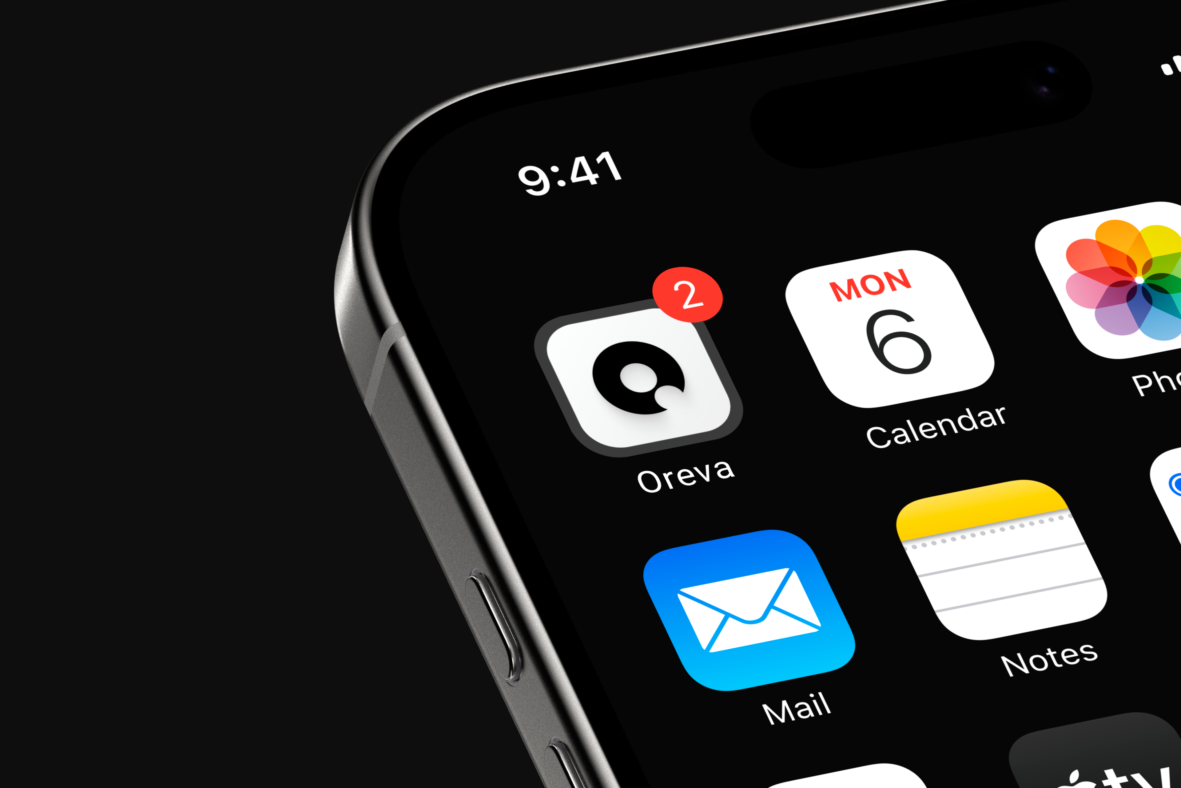
This is where the flexibility of the system matters most: expressive when Oreva is communicating, restrained when someone is using it.
05 / Outcome
Outcome
A recognisable world around the product.
The final identity gives Oreva a language that can move between technical communication, digital environments and broader brand expression without changing character each time.
More importantly, it gives the company an identity centred on the people it is building for rather than the category it happens to operate in.
That leaves Oreva room to evolve alongside the technology without needing its visual identity to chase every change around AI.



Reflection
Oreva reinforced something useful for us: designing for technical audiences doesn't require filling an identity with technical references.
The stronger direction came from understanding the culture around the product and deciding which parts deserved to become visible.