

1904 Studios
← Archive
1904-WRK-001

Mealport

Designing a modern commerce platform that makes ordering food and groceries effortless — from discovery to doorstep.

Industry
Food & Grocery Commerce
Services
Brand Identity, Product Design, Development, Deployment
Timeline
2025 · Ongoing
Role
Brand, product design & engineering partner
Platform
Figma
Mealport cover — a flat illustration of an outstretched hand holding a plate, fresh produce bursting upward from it, against a yellow and blue tiled tunnel.
Image
A-01
§ 01
Identity

Recognised in a hurry

Mealport is read on a phone, mid-errand, by someone who is hungry. The identity had to survive that — legible at a glance, warm without being cute, and consistent enough that a customer, a vendor and a rider all know they are in the same place.
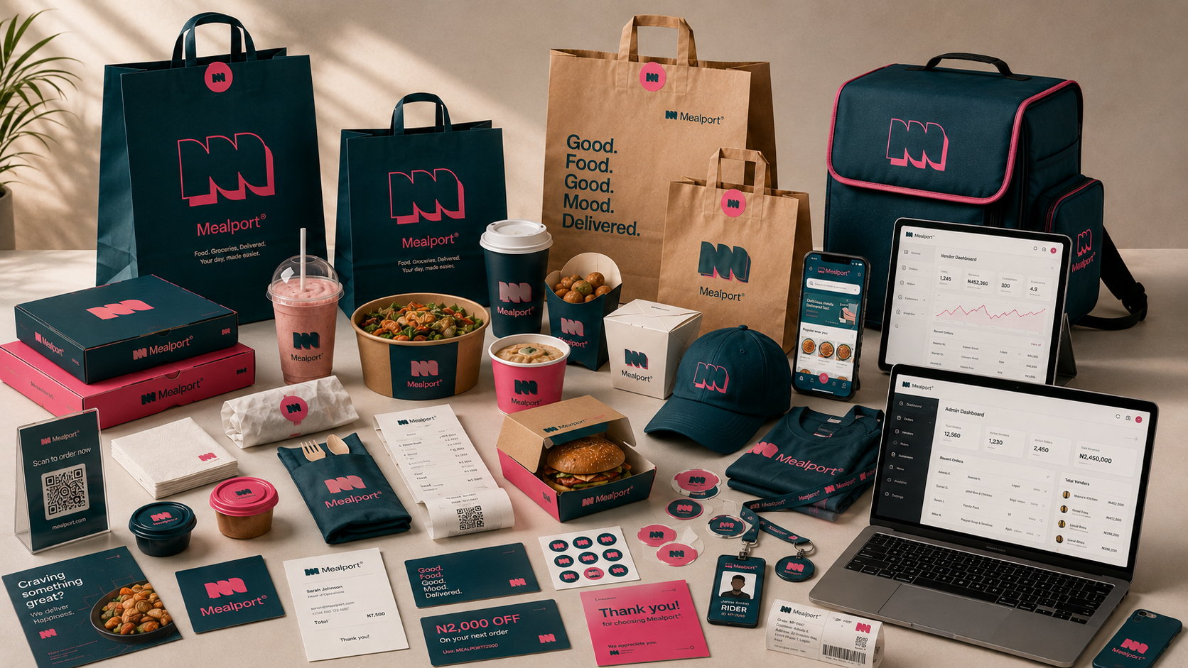
The Mealport identity applied across the delivery kit — teal and pink carrier bags, food boxes, cups and cartons, a rider's cap, t-shirt, ID badge and insulated backpack, stickers, loyalty cards and receipts, with the customer app and vendor dashboards on phone, tablet and laptop, every piece carrying the arched M mark.
BrandImage
Visual Direction
§ 02
Brand Construction

One mark, four audiences

The same mark sits on a customer's order screen, a vendor's dashboard and a rider's phone. It is set out on plain geometry so it holds at app-icon size, and given enough clear space that a busy interface can never crowd it.

The Mealport logo — the arched M mark beside the Mealport wordmark, set horizontally in black.
FIG. A — Lock-upLogo and wordmark · clear space
The Mealport icon mark in black — an M built from three rounded arches, with an offset copy of itself drawn as an outline behind it.
FIG. B — IconSetting out
The Mealport icon mark in full colour — the arched M in teal over an offset copy in pink.
Full colour
The Mealport icon mark in black — an M built from three rounded arches, with an offset copy of itself drawn as an outline behind it.
Monochrome black
The Mealport icon mark knocked out in white, for dark grounds.
Monochrome white
FIG. C — VariantsColourways
§ 03
Product

Discovery to doorstep

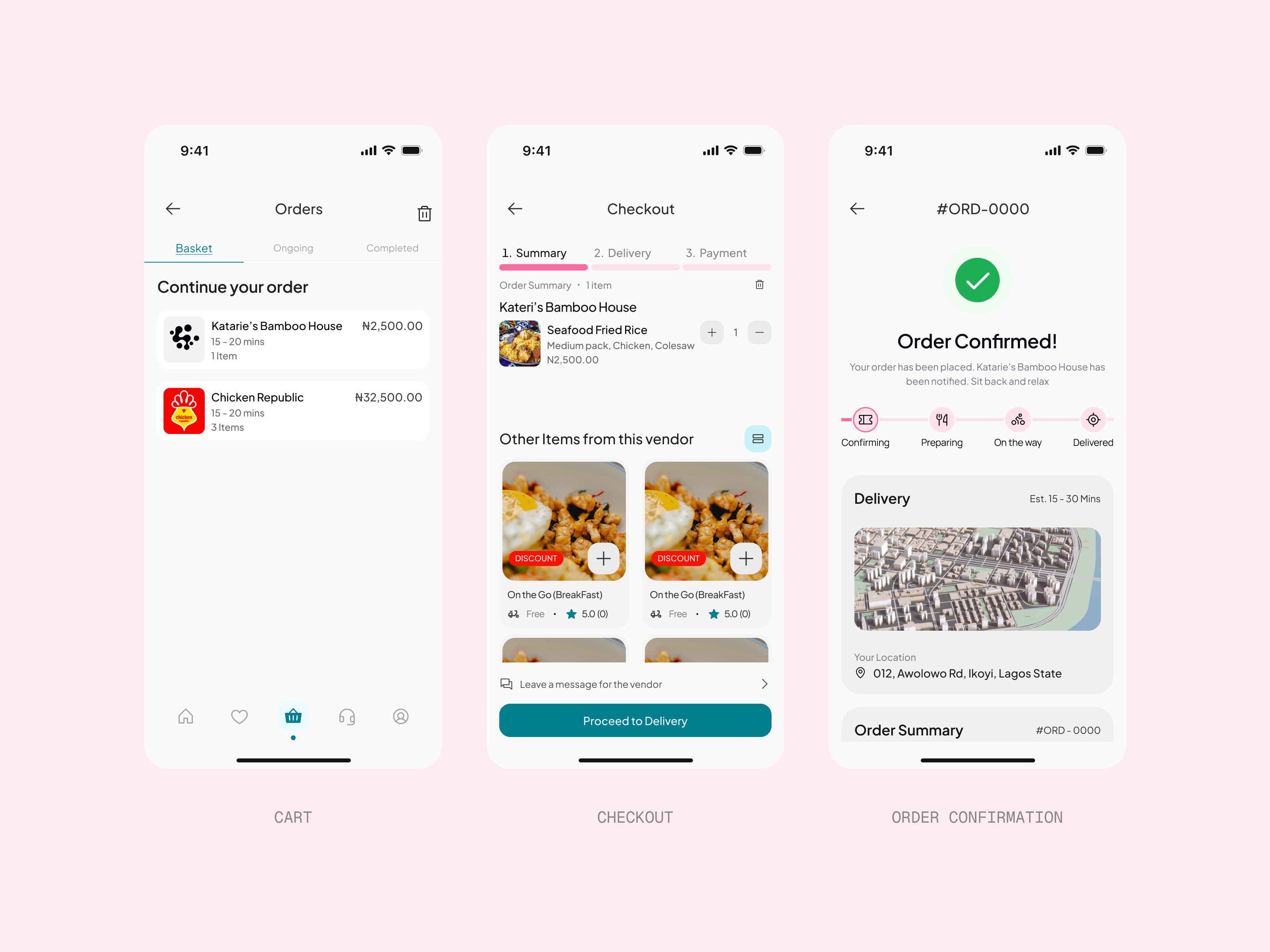
Ordering is the easy part. Knowing what happens afterwards is not, and the customer experience is built around that gap — find something, order it, and never have to ask where it is.
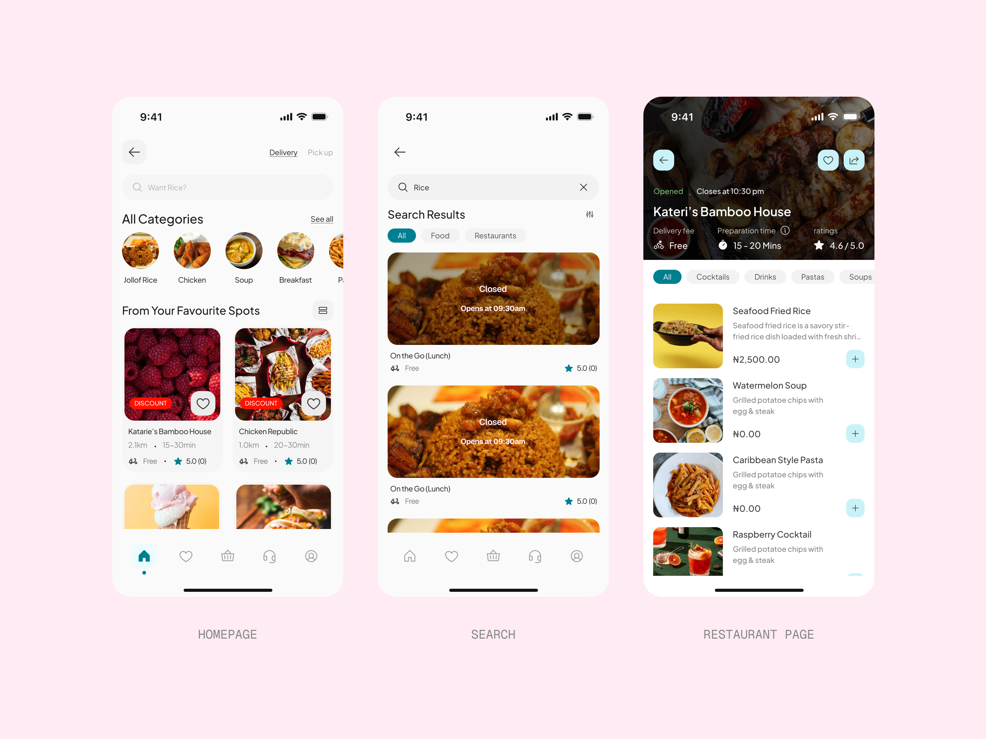
Three Mealport phone screens on pink — the homepage with its category row and favourite spots, a search for “Rice” returning closed vendors, and Kateri's Bamboo House with its menu, delivery fee, preparation time and rating.
Image
Core Product
The order continued across three screens — a basket holding two vendors, a checkout summary with delivery and payment still ahead, and the confirmation showing the order accepted with a map and a four-stage delivery tracker.
Image
Core Product
§ 04
Signature Experience

The order, tracked

The strongest moment arrives after checkout. Following an order from the kitchen to the door is where a delivery platform either earns trust or loses it, so it is the part designed with the most care and the fewest words.
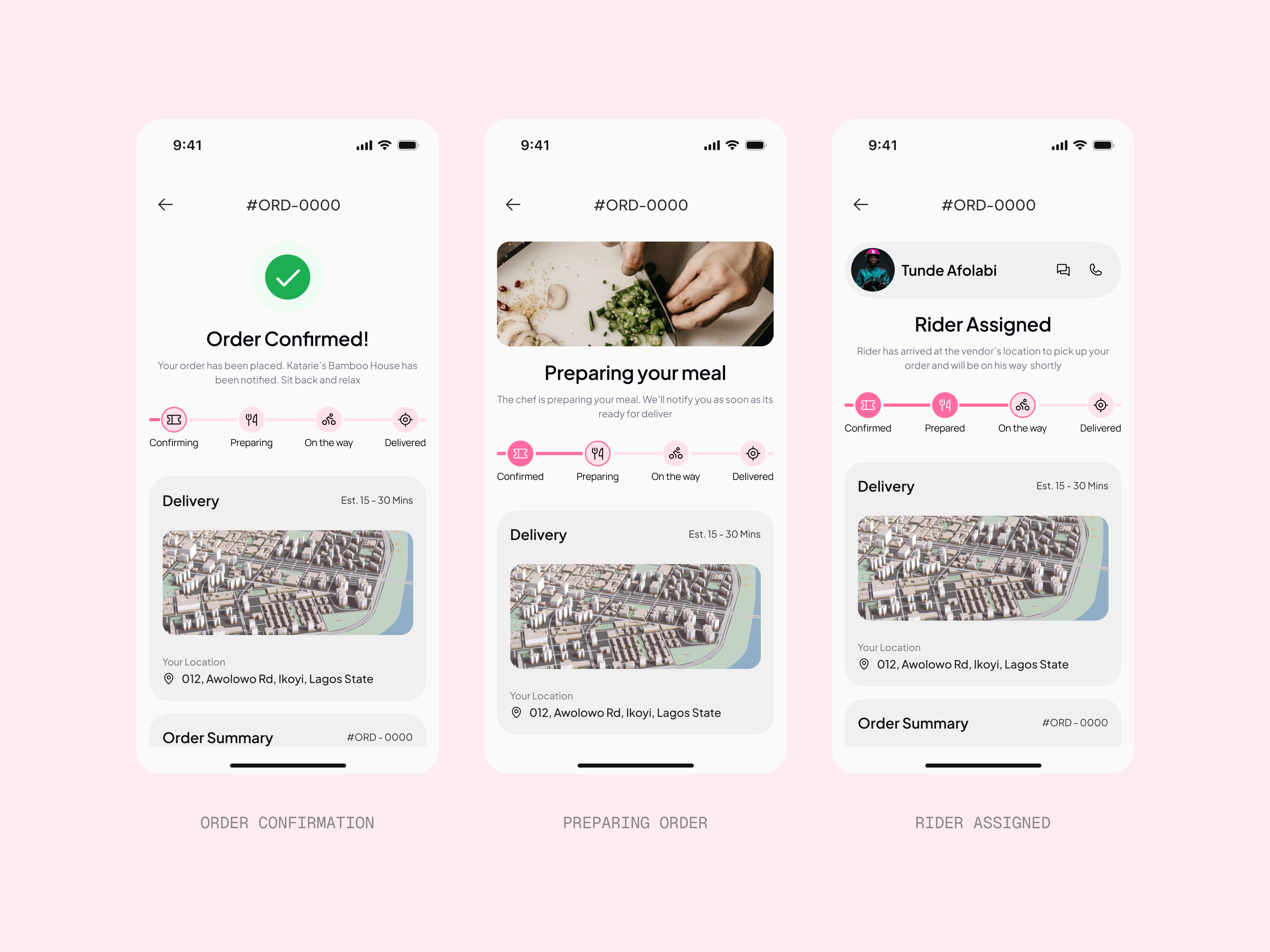
The first half of the tracking flow — order confirmed, the chef preparing the meal, and a rider assigned by name with a call and message button, the four-stage tracker filling in pink across all three screens.
Image
Signature Flow
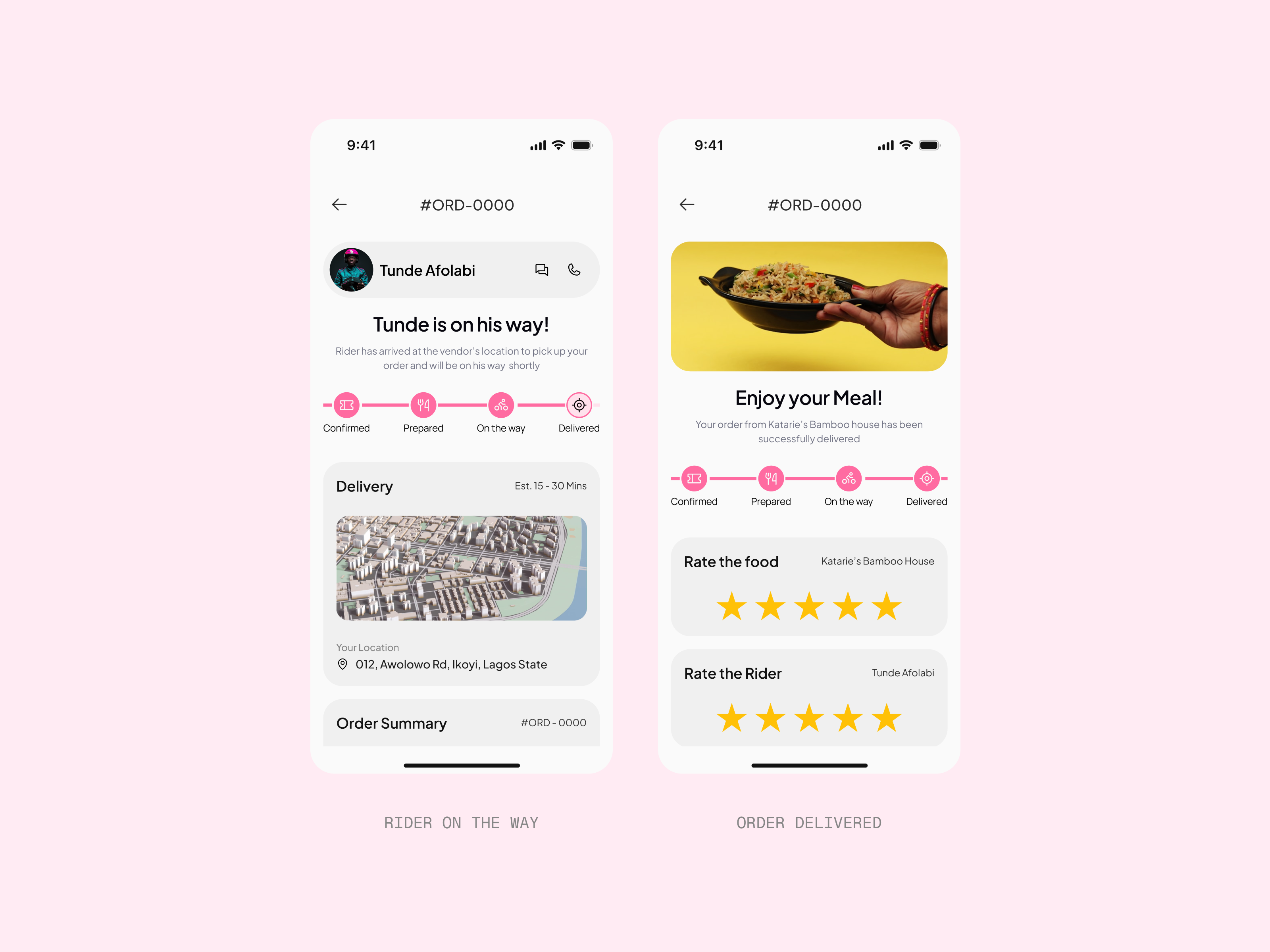
The flow closing out — the rider on his way with the map live, and the delivered screen inviting a rating of both the food and the rider, the tracker now full to its last stage.
Image
Signature Flow
§ 05
Ecosystem

Four products, one system

Customers, vendors, riders and administrators each get an interface built for their job, rather than one shared interface bent to fit all four. A single design system holds them together, so the platform reads as one thing while behaving like four.

§ 06
Closing Showcase

Ready to launch

Brand, product and engineering were built together rather than handed between teams. That is why the thing that shipped is the thing that was designed.

Brand Identity

Product Design

Design System

Development

Deployment