


TurkishWears is a fashion and e-commerce brand built around a curated retail experience.
Our work covered the identity and its digital expression, establishing a visual language that could give the brand a recognisable presence while keeping the product at the centre of the experience.
The challenge was one of balance: TurkishWears needed enough character to feel distinct, but not so much that the identity began competing with the clothes themselves.
01 / Brand Idea
Brand Idea
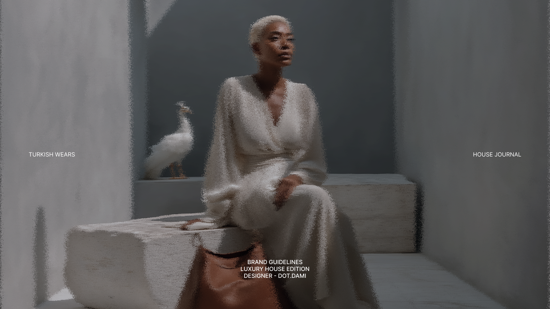
Give the product room.
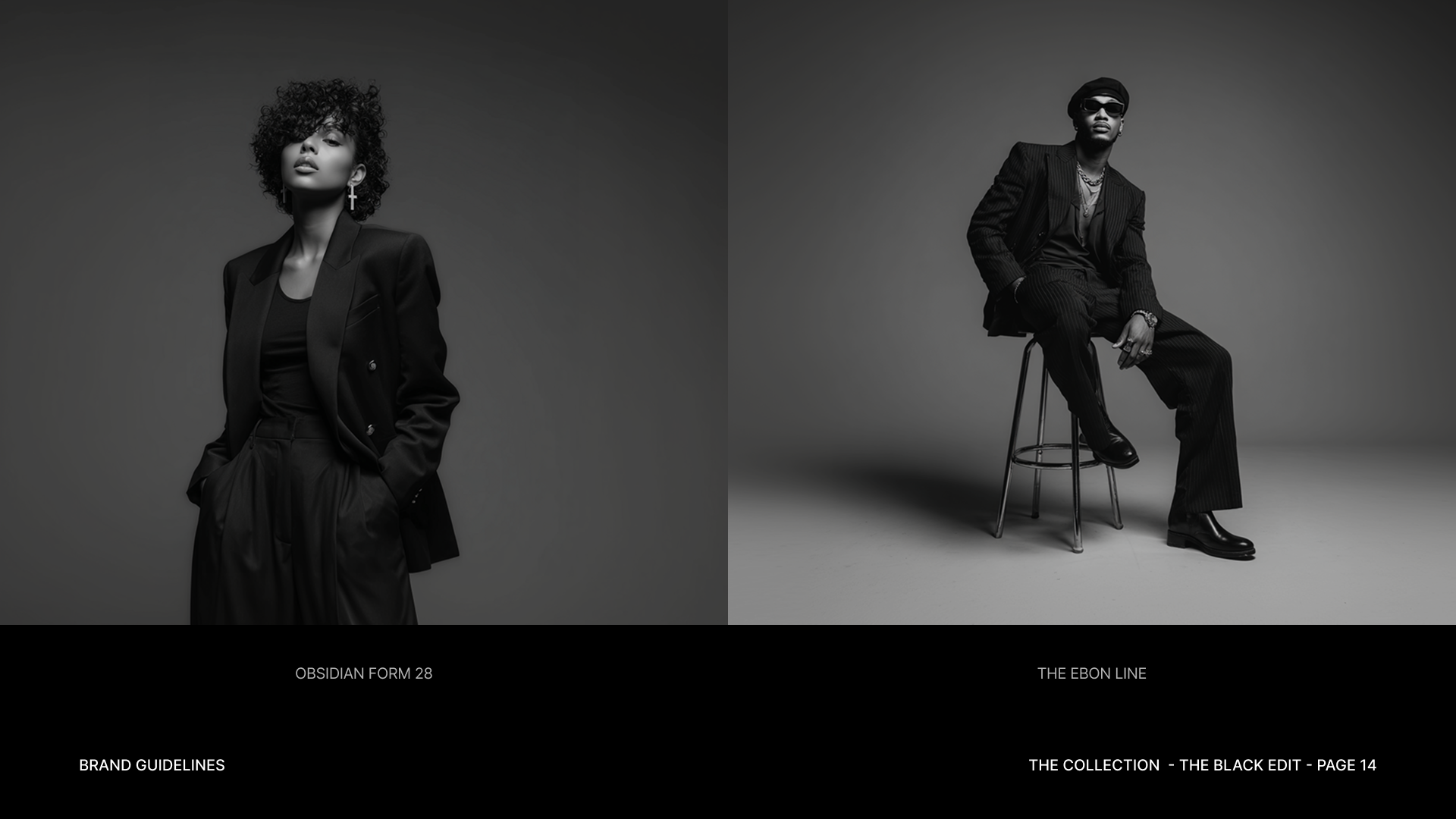
Fashion already brings colour, texture, silhouette and personality into the frame.
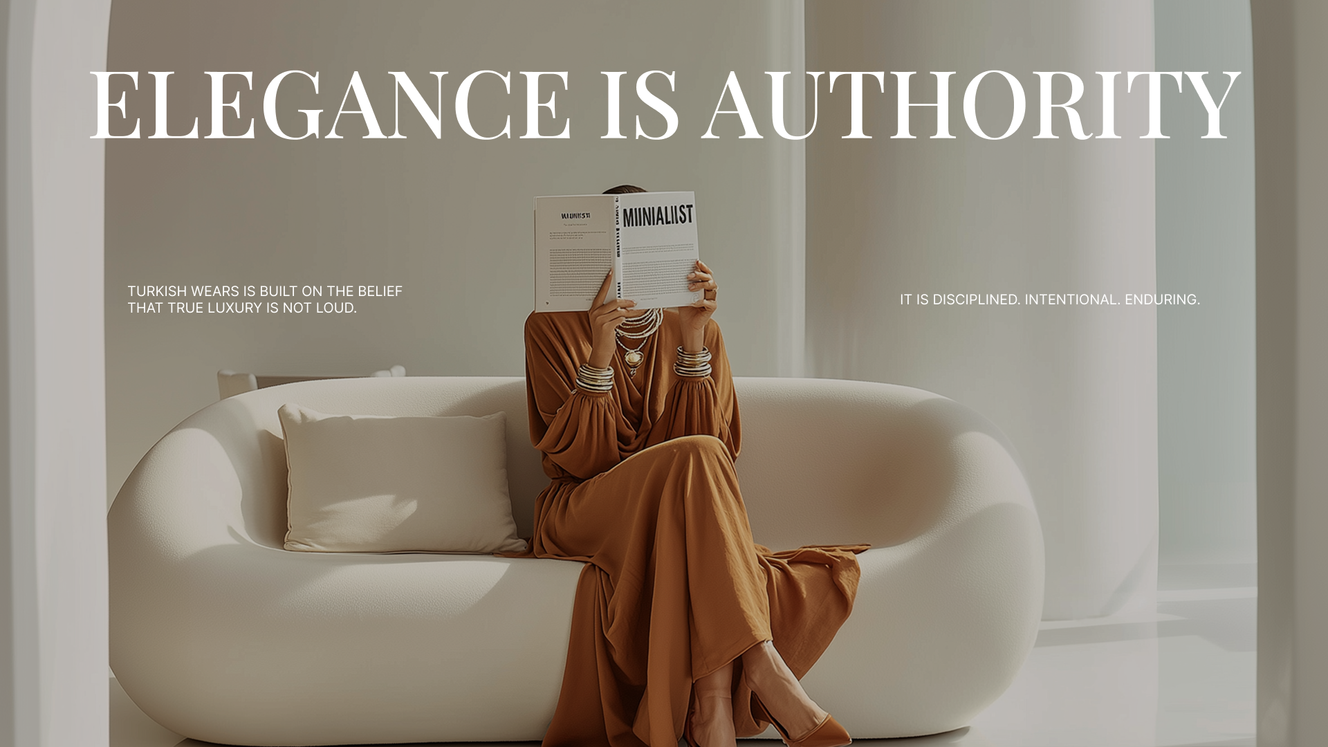
Rather than adding another layer of visual noise around it, we built TurkishWears around restraint. Typography, space and composition create the structure; the product provides much of the expression.
That gave us a simple principle for the identity and the storefront:
When the product has something to say, the brand knows when to step back.
02 / Identity
Identity
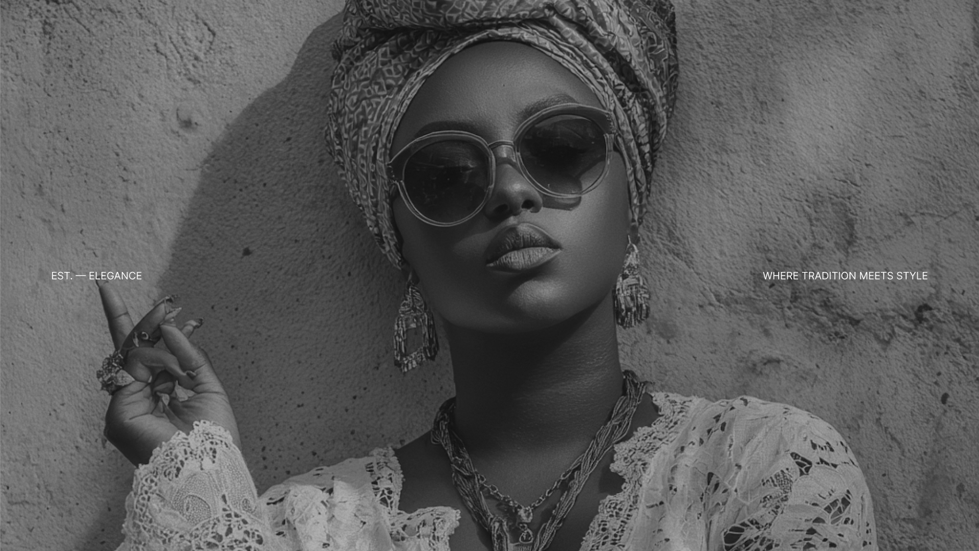
Recognition without excess.
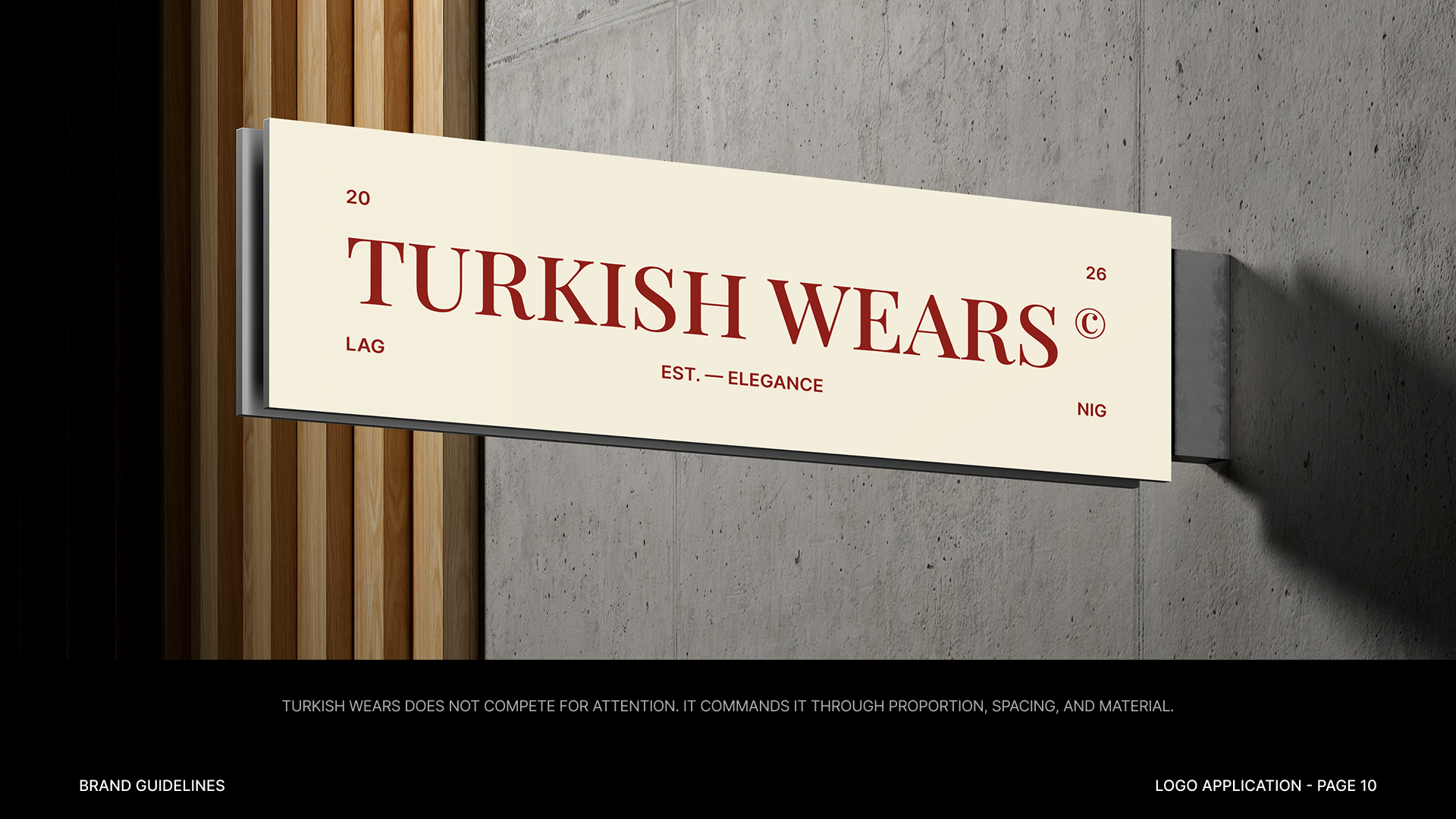
The TurkishWears identity was designed as a quiet framework around a constantly changing catalogue.
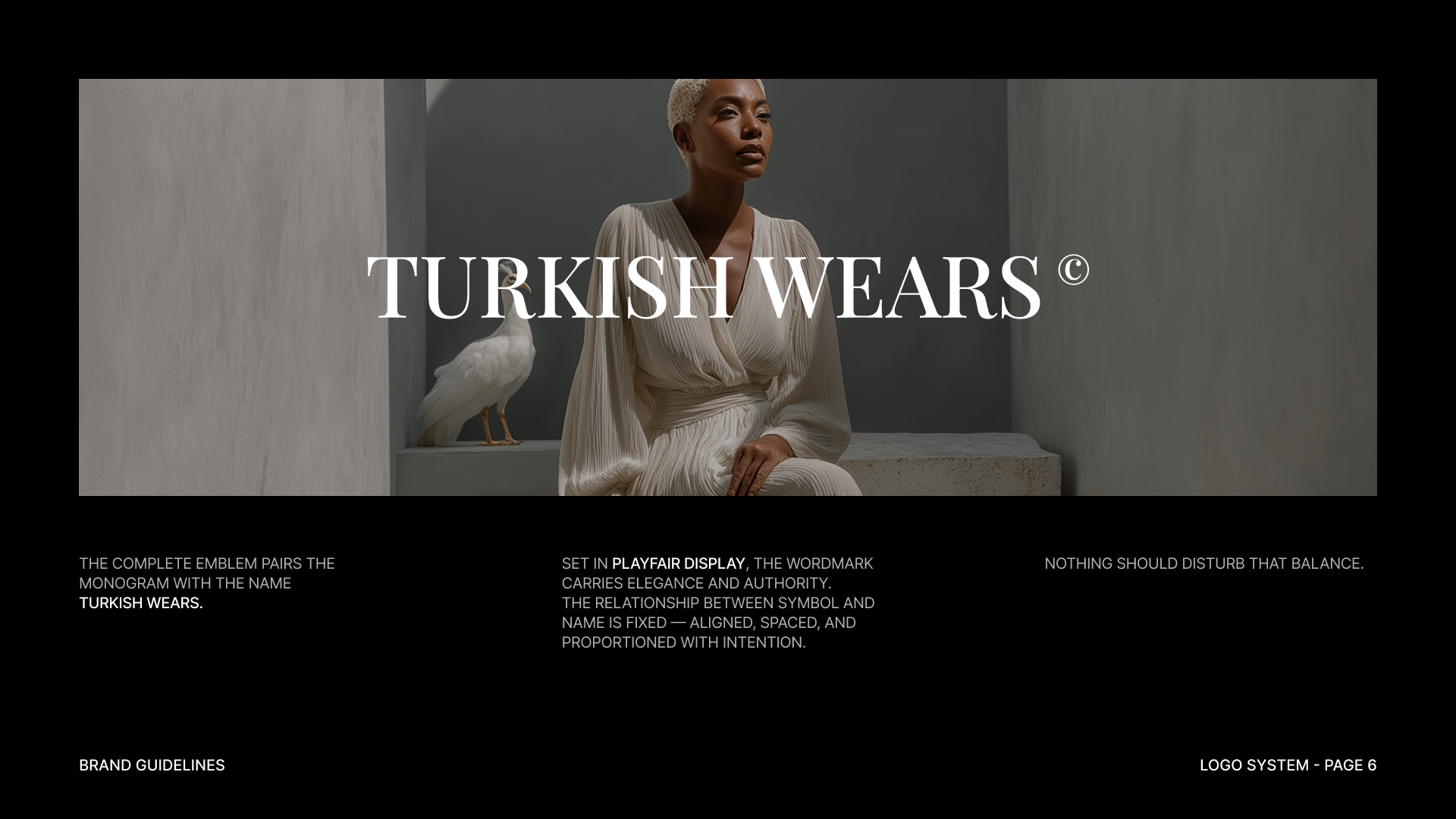
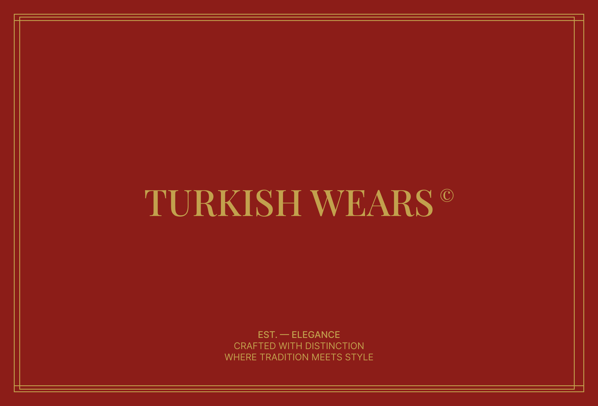
Rather than depending on decorative graphics to create recognition, we focused on the elements that would appear repeatedly: the wordmark, typography, proportion, colour and the way imagery is composed.
That keeps the system consistent even as collections, products and photography change.


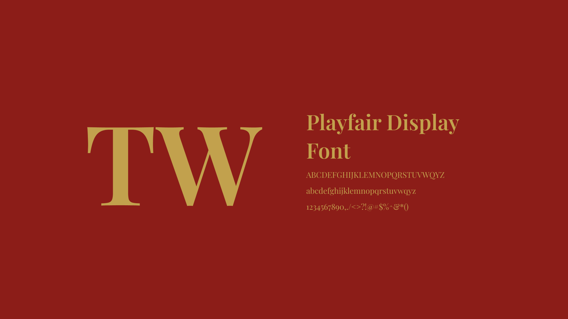
Typography
Typography carries much of the brand's structure.
Its role is deliberately functional: establish hierarchy, support product information and give larger brand statements enough presence without overpowering the imagery around them.
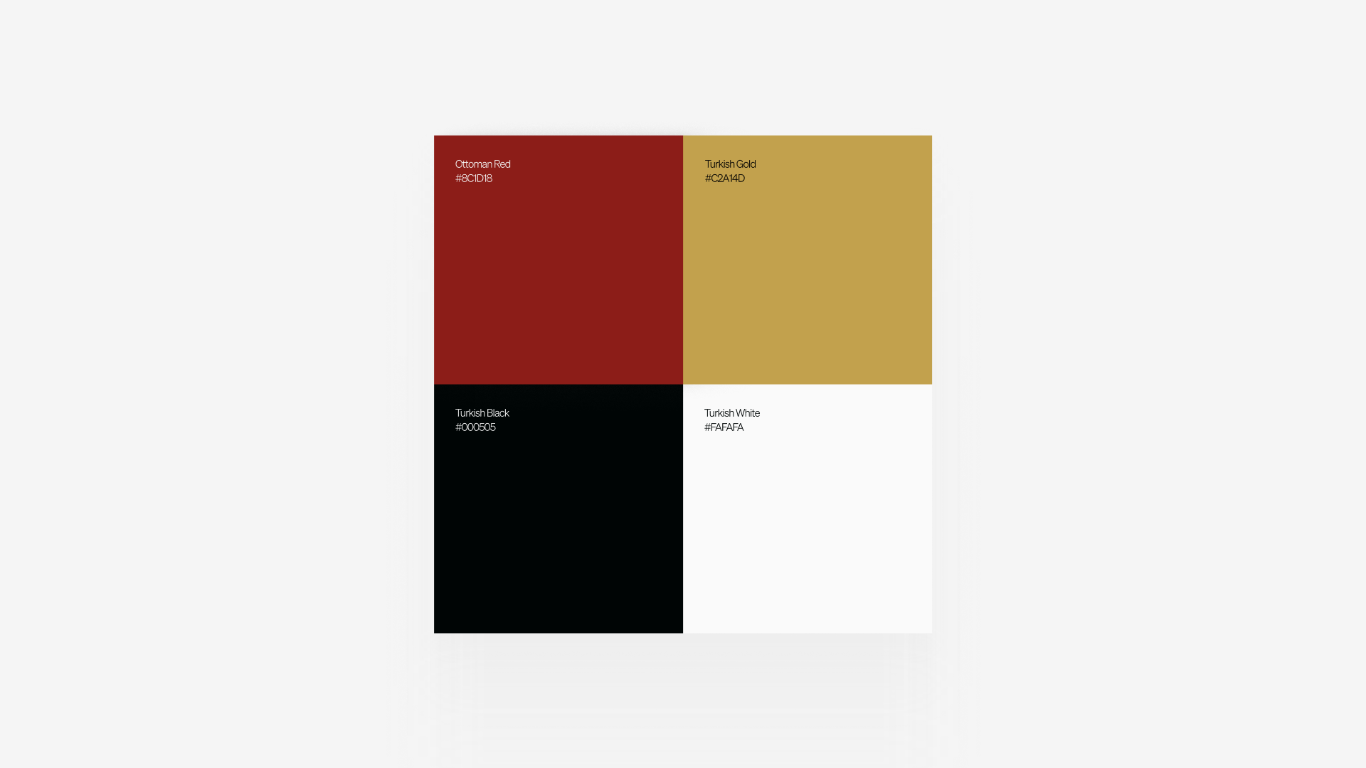
Colour
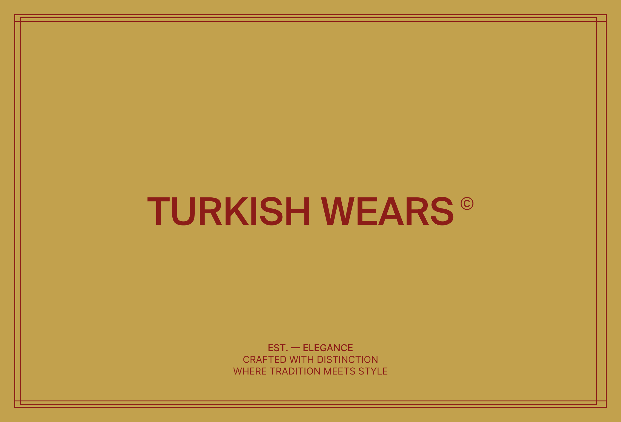
The palette provides a controlled foundation for the identity rather than defining the mood of every product.
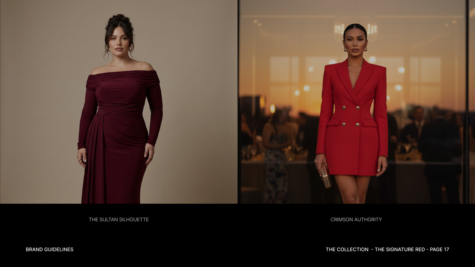
This allows different garments and photography to introduce their own colour while the surrounding system remains recognisably TurkishWears.
03 / Applications
Applications
A system that changes with the collection.
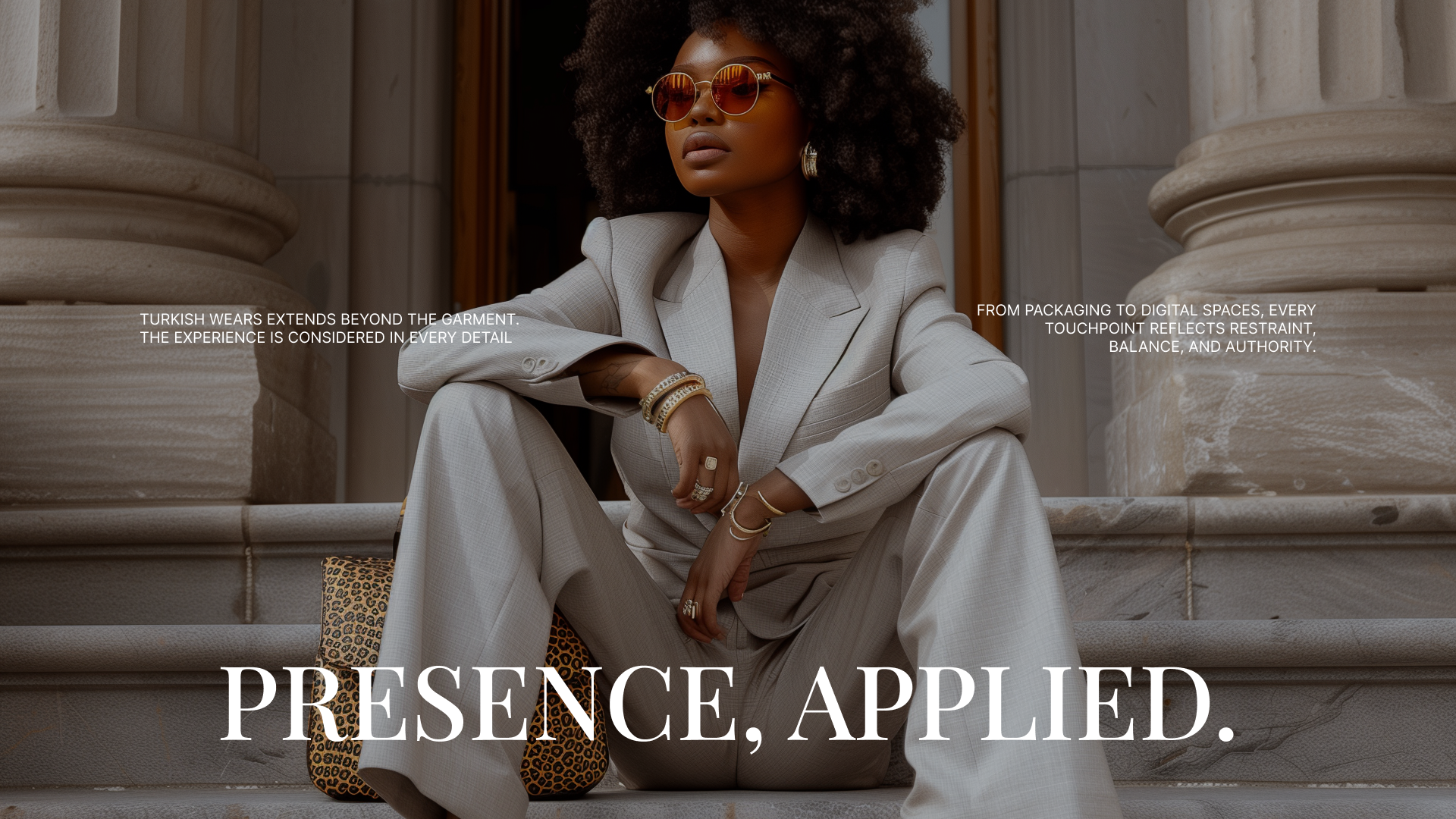
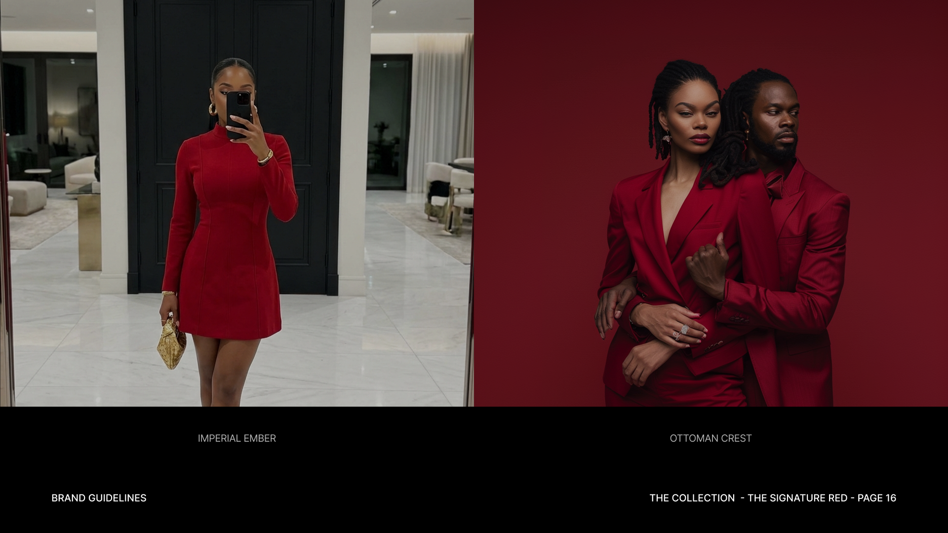
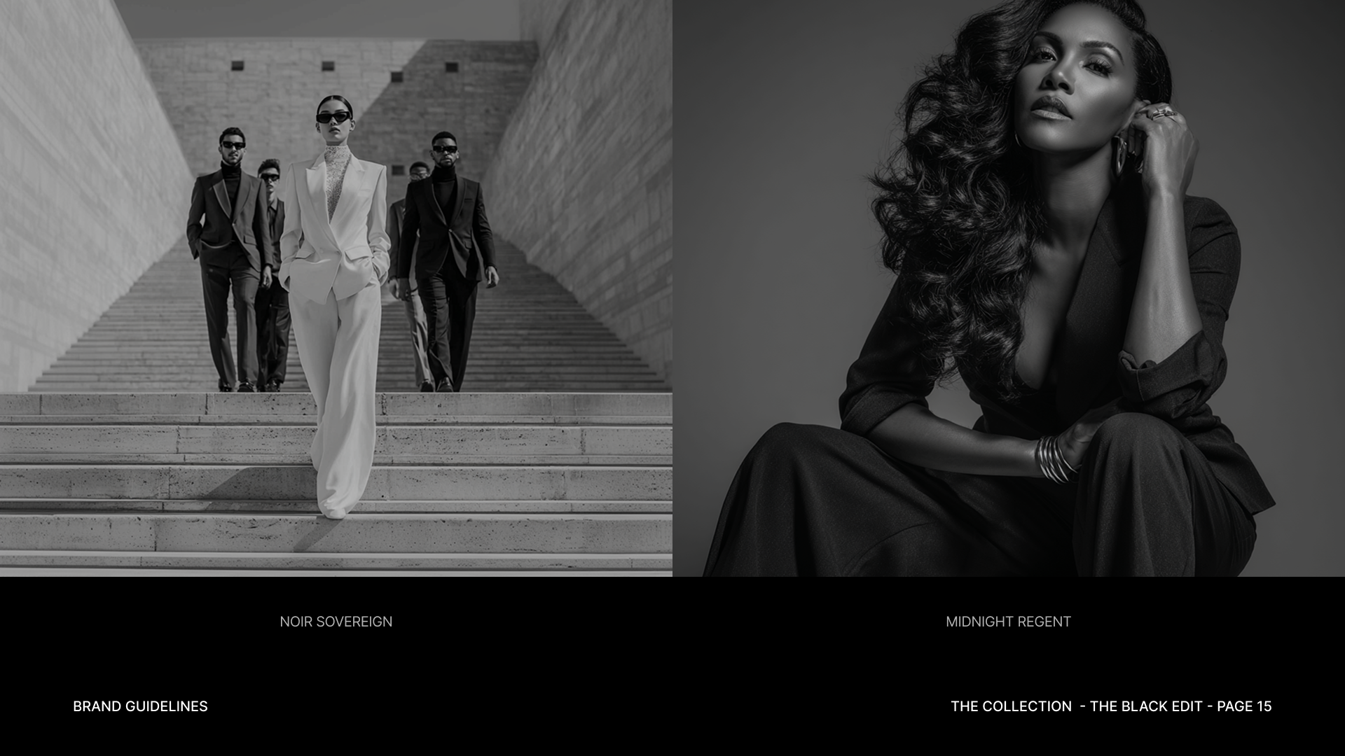
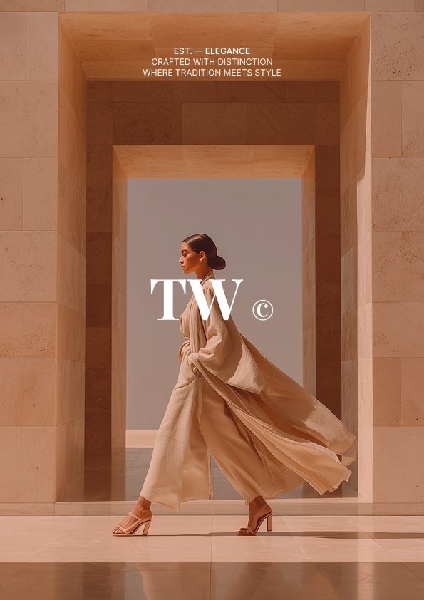
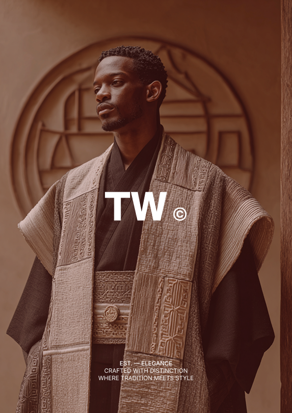
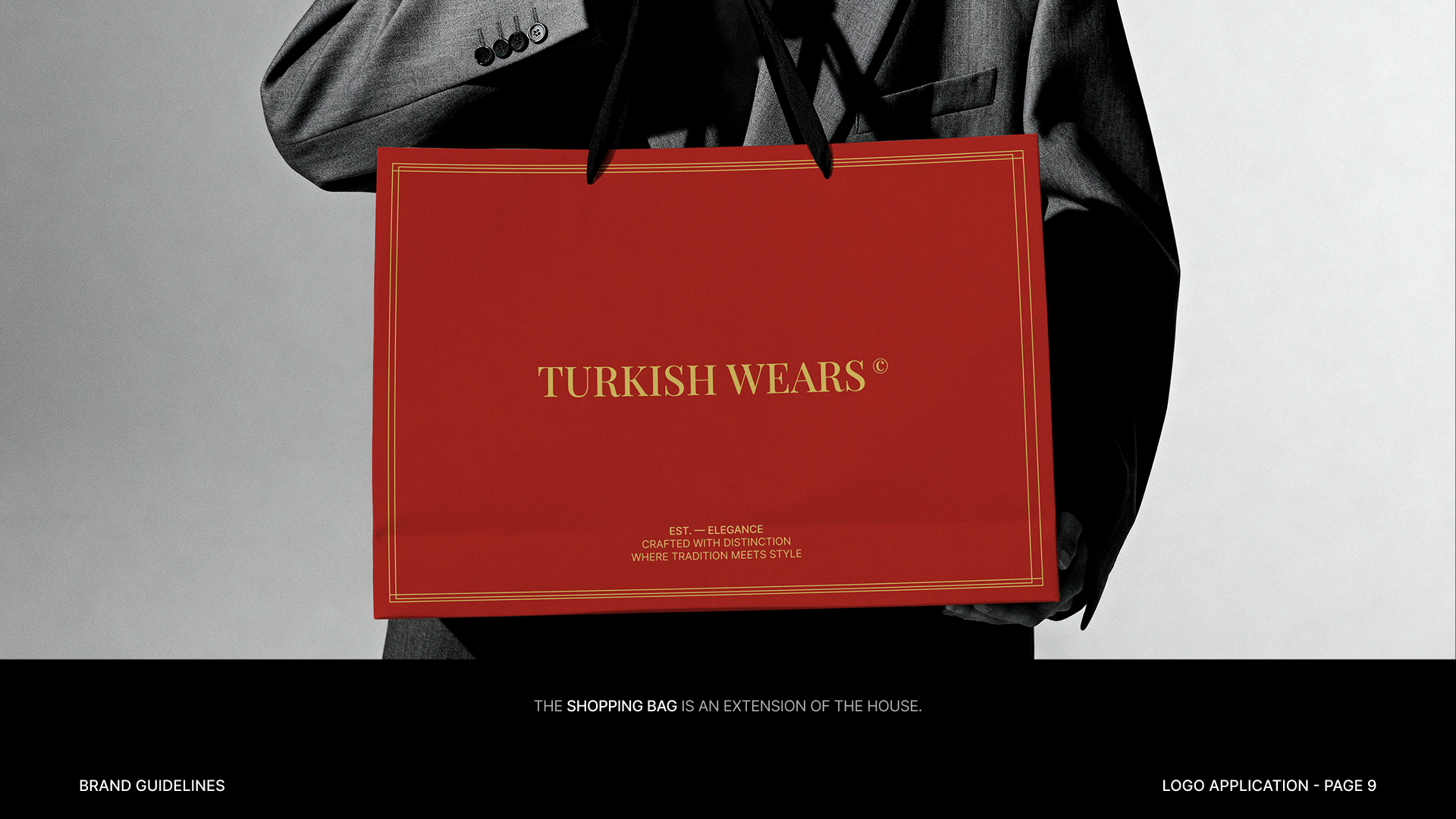
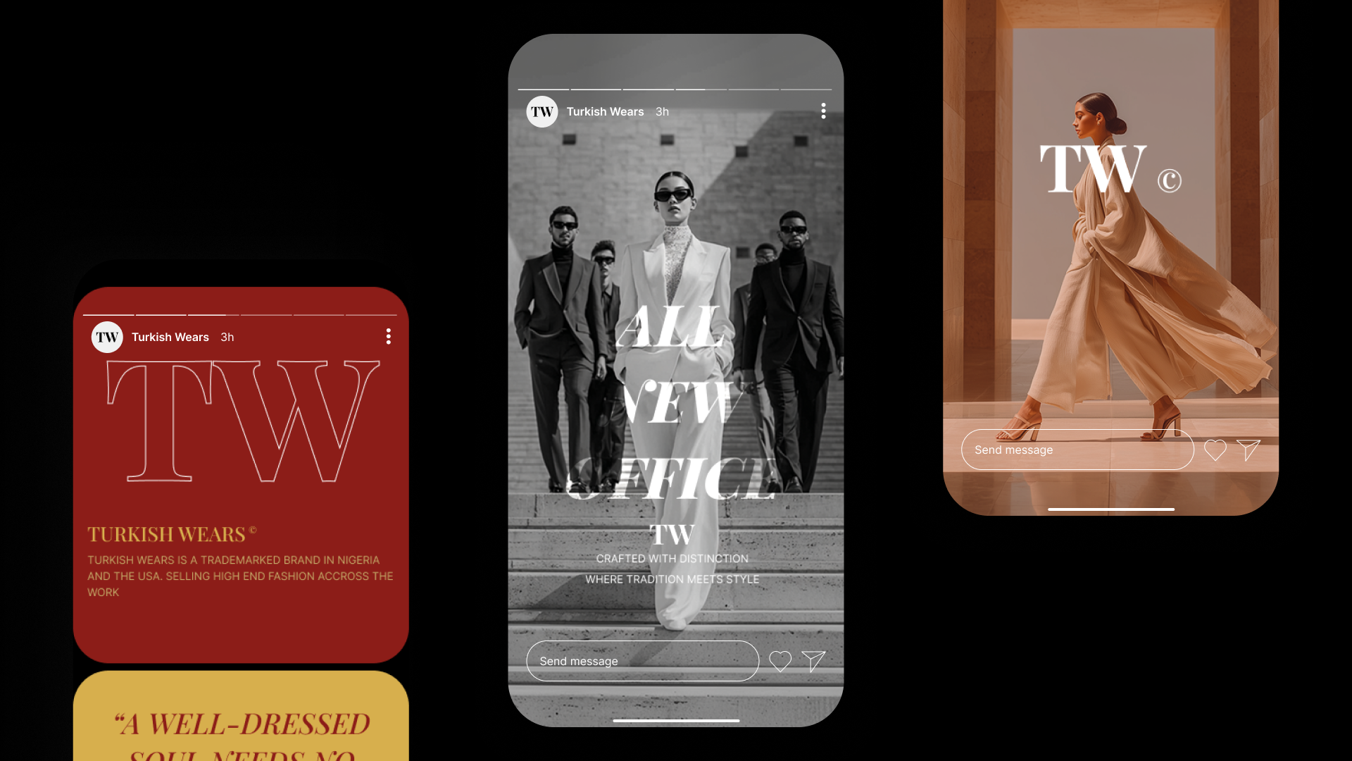
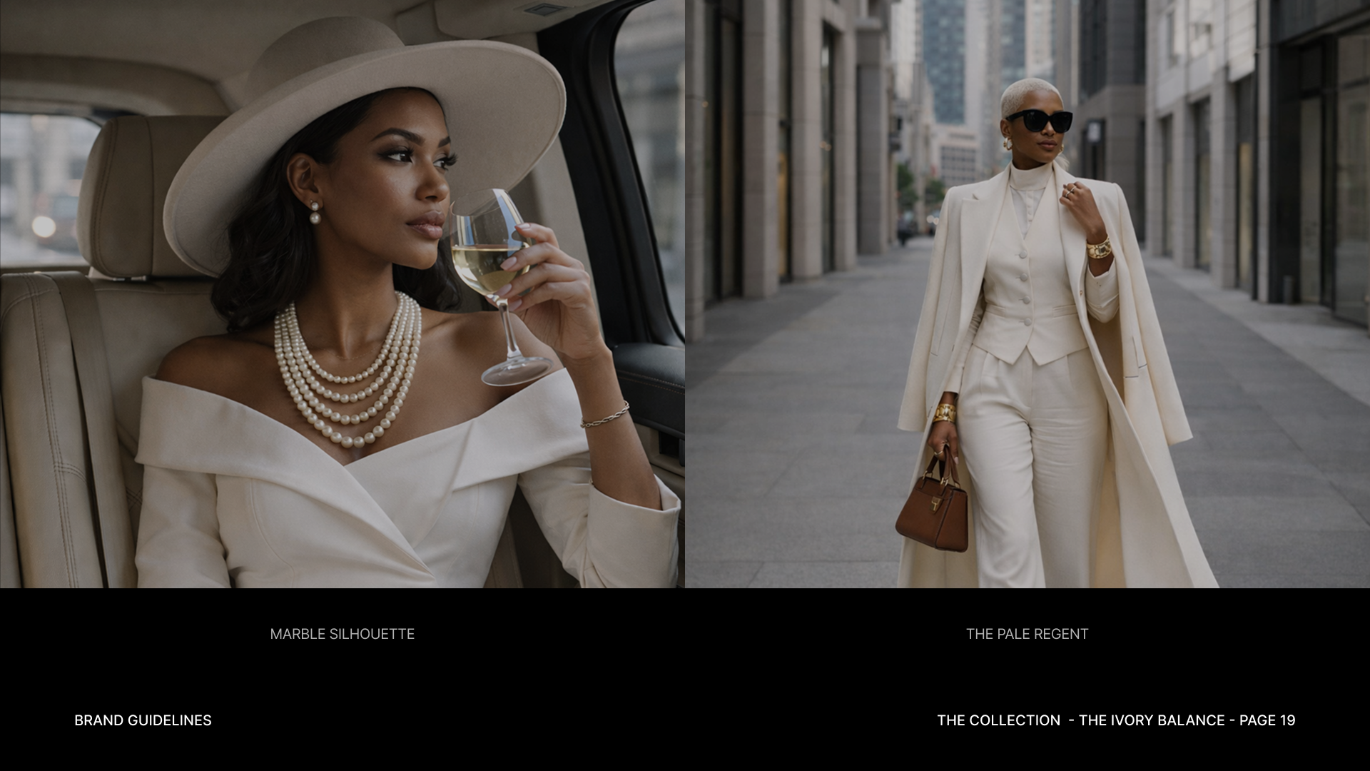
A fashion identity rarely appears in isolation. It lives beside garments, photography, campaigns, packaging and the smaller details surrounding a purchase.
We designed the system to remain recognisable across those contexts without requiring every application to look identical.
The constants stay controlled. The product, imagery and collection provide the variation.
04 / Digital
Digital
Turning the identity into a storefront.
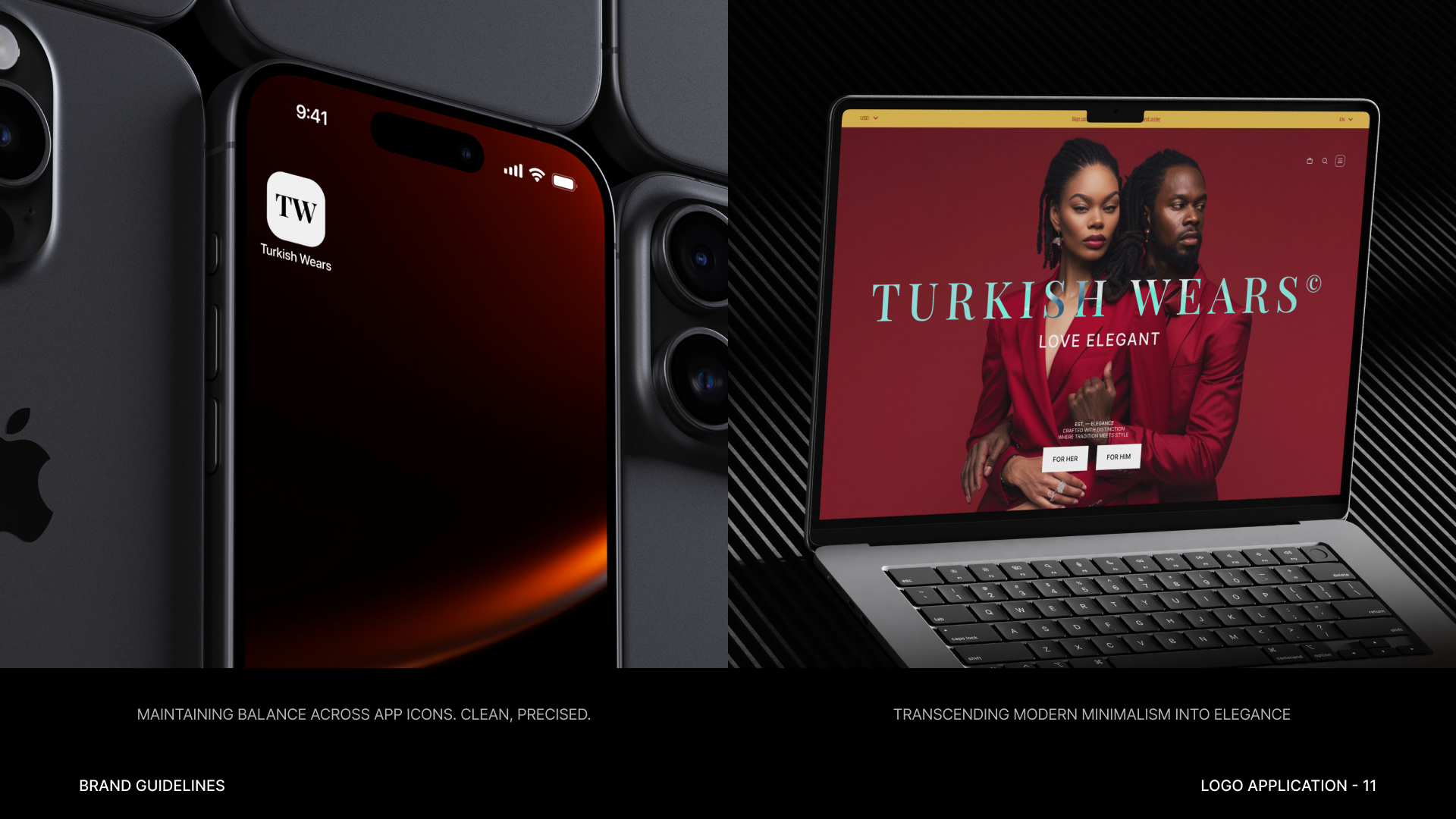
The digital experience had to do more than carry the TurkishWears visual language. It also had to work as a store.
We kept the interface restrained so product imagery, names, pricing and purchasing information could establish a clear hierarchy. Brand expression becomes stronger where it helps set the mood and quieter where the customer is trying to browse or make a decision.
Discovery
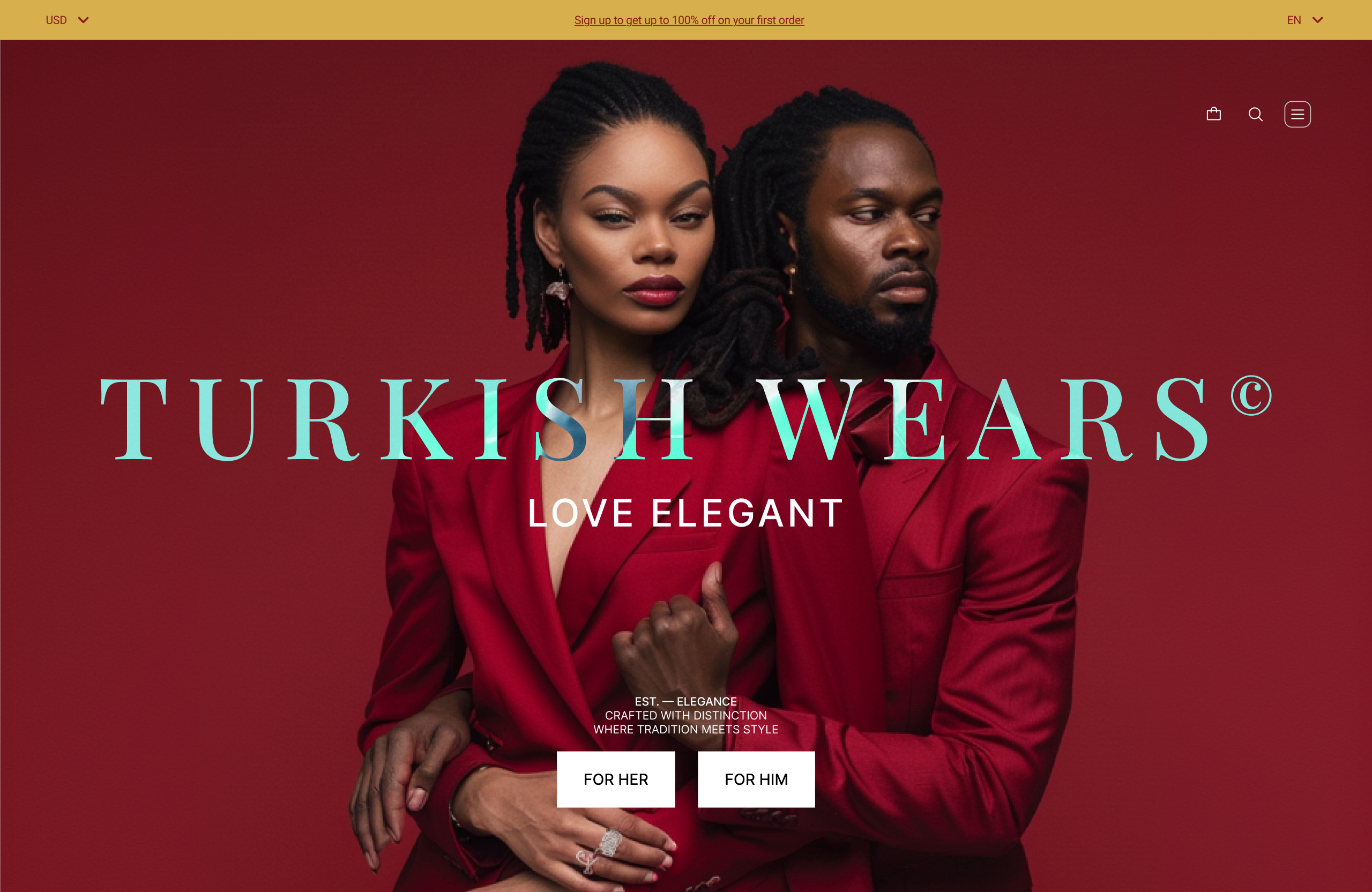
The storefront introduces products and collections without trying to expose everything at once.
Imagery leads, while navigation and supporting interface elements give customers clear ways into the catalogue.
Product
As interest becomes more specific, the interface gives individual products more room.
Photography, product information and purchasing actions take priority, while the wider brand system remains present without interrupting the decision.
Purchase
Closer to purchase, the interface becomes quieter again.
The same hierarchy and interaction language continues into the transactional experience so moving from product discovery towards buying doesn't feel like entering a different system.
The result is a digital expression where brand and commerce take turns leading rather than competing for attention.
05 / Outcome
Outcome
One identity, changing merchandise.
The resulting system gives TurkishWears a consistent foundation across brand communication and digital commerce while leaving enough room for the merchandise to keep changing.
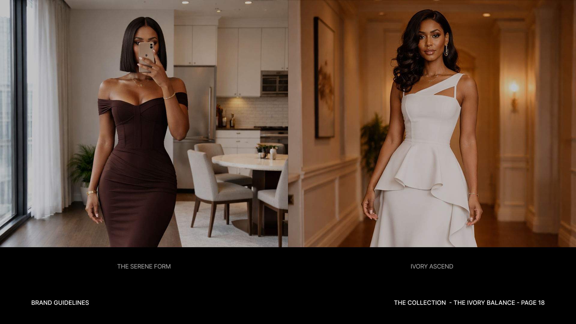
Collections can introduce different imagery, colours and personalities without requiring the identity around them to be reinvented each time.
That balance is what makes the system useful: TurkishWears remains recognisable, but the clothes still get to be the most interesting thing in the frame.

Reflection
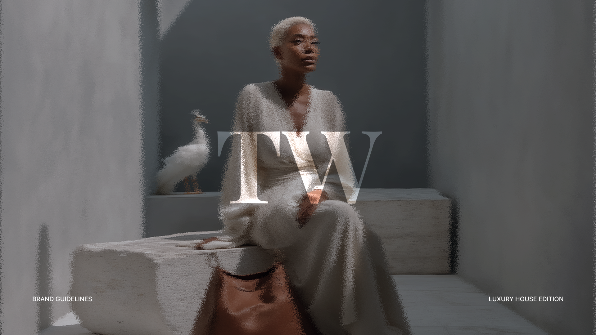
TurkishWears reinforced that restraint can be an active design decision.
The work wasn't about removing character from the brand. It was about deciding where that character needed to come from. Once the product and photography were allowed to carry more of the expression, the identity could concentrate on giving everything around them structure.