

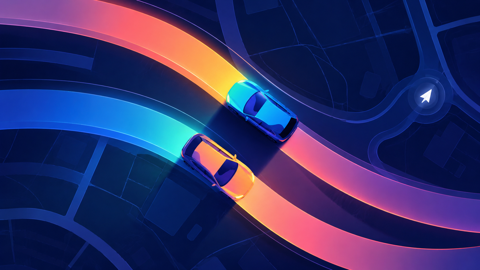
01 / Context
Project Context
QuickRoute is a Cyprus-based navigation product designed around helping drivers move through the road network with better information about their journey.
Unlike products people use while sitting still, navigation has to communicate while attention is divided between the interface and the road.
Our work focused on turning route and map information into an experience that could remain useful without constantly demanding attention.
- Market
- Cyprus
- Product
- Navigation Application
02 / Problem
The Navigation Problem
A map can contain an enormous amount of information. A driver can only process a small amount of it at once.
Routes, turns, locations, road conditions and journey progress can all be useful, but showing everything with equal importance makes the interface harder to read precisely when clarity matters most.
The challenge wasn't simply deciding what QuickRoute could display.
It was deciding what a driver needs to know now, what can wait and what should remain in the background.
03 / Journey
Understanding the Journey
We looked at navigation as a sequence of changing information needs rather than one continuous map screen.
Where am I going? → Which route should I take? → What do I need to do next? → Has anything changed? → Have I arrived?
Before movement begins, comparison matters. During navigation, the next action matters more. When conditions change, the interface needs to communicate that change without making the driver reinterpret the entire journey.
That distinction shaped the hierarchy of the product.
04 / Decisions
Key Decisions
Make the route the dominant layer
Maps naturally invite detail, but navigation needs hierarchy.
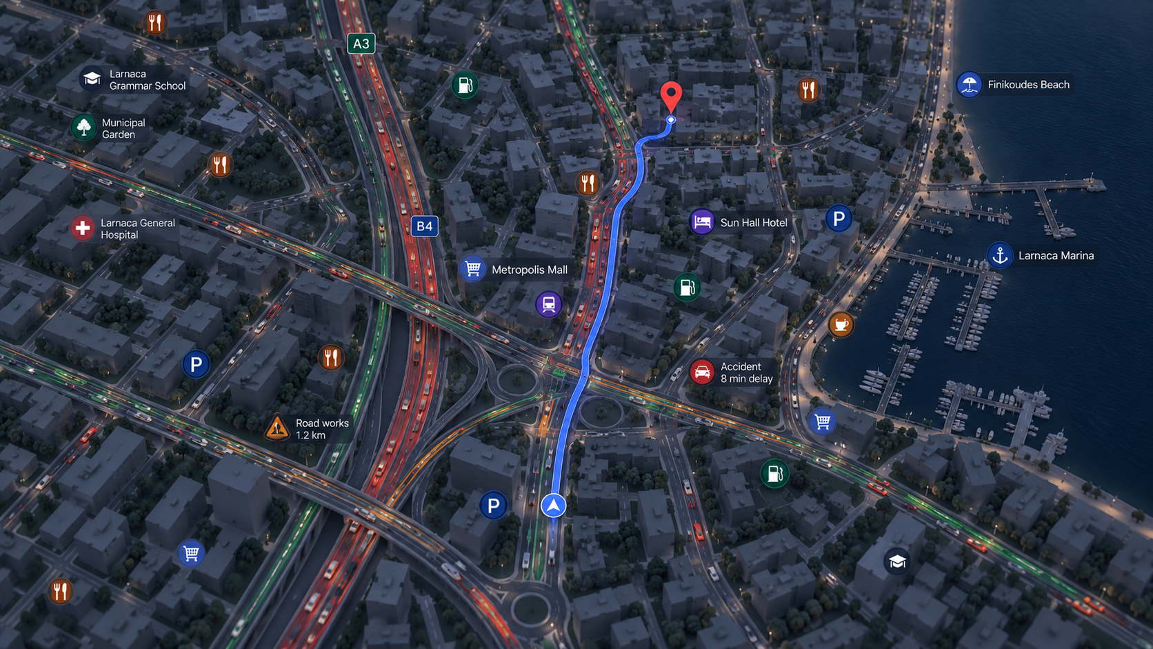
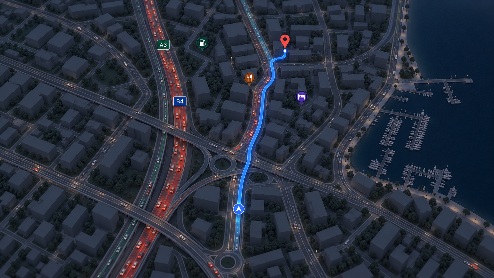
We kept the active route visually dominant while allowing surrounding geography and secondary information to provide context without competing for attention.
Change the interface as intent changes
Planning and active navigation are different tasks.
Route selection can accommodate comparison and additional information. Once the journey begins, the interface becomes more focused around direction, progress and immediate context.
Prioritise the next decision
During navigation, information becomes more valuable as it becomes more immediate.
We designed the hierarchy around what the driver needs to do next rather than giving every upcoming piece of information the same prominence.
Make changes noticeable without making them disruptive
Navigation is dynamic. Information can change after a journey begins.
States that affect the route need enough visual prominence to be noticed while preserving the driver's understanding of where they are and what happens next.
Keep controls within reach
Navigation interfaces often need to be operated quickly.
Primary actions were kept easy to identify and access, while secondary controls were moved away from the main navigation hierarchy.
06 / Map
Designing the Map
The map is both the largest visual element and the background for almost every other interaction.
That made restraint especially important.
We established hierarchy between the active route, surrounding roads, geographic information, markers and interface controls so the map could remain useful without becoming visually noisy.
Information by importance
Not every map element needs the same contrast.
The active journey receives the strongest emphasis. Supporting geography provides orientation. Secondary information remains available without competing with the route.
A system of states
Navigation also required thinking beyond the ideal route.
Location, route selection, active navigation, changes and arrival each introduce different combinations of information.
We treated these as related states within one system rather than separate screen compositions.
07 / System
Building the Design System
A navigation product contains repeated patterns that need to remain recognisable even as the map underneath them changes.
We established reusable rules for typography, controls, cards, sheets, icons, navigation instructions and interface states.
Consistency here isn't simply visual. A control that means one thing during route selection should remain understandable when it appears during navigation.
The system gives QuickRoute a foundation for extending the experience without introducing a new interaction language for every feature.
Designing for movement
QuickRoute is used in a context where attention is limited.
That changed how we approached density, typography, touch targets and interaction hierarchy. Important information needed to be understood quickly, and common actions needed to remain accessible without requiring careful interface exploration.
We reduced unnecessary competition between controls and used progressive information rather than presenting every available option at once.
The goal wasn't to make the interface empty. It was to make the important parts easier to notice.
08 / Outcome
Outcome
The final experience
The resulting product brings route planning and active navigation into one coherent interaction system.
- Destination
- Find and confirm where the journey is going.
- Route
- Understand the available path before setting off.
- Navigation
- Keep the next action and journey progress clear while moving.
- Context
- Introduce relevant road and route information without overwhelming the map.
- Arrival
- Close the journey with a clear change of state.
What happened
QuickRoute developed into a defined navigation experience with a consistent interaction and visual system across the core journey.
The work established how the product behaves from destination selection through route planning, active navigation and arrival, giving future navigation capabilities a common UX foundation to build from.
Reflections
QuickRoute made us think differently about information density.
In many products, additional information can simply live further down a page or behind another interaction. Navigation doesn't have that luxury. Information is competing not only with other interface elements, but with the user's attention to the physical world.
That made prioritisation one of the most important design decisions in the project.